Design products that reshape the future.
Motion-first. AI-readable. Built in the open.
Amaca is my personal design system. It started as a side project — a place to practice the kind of system I'd been wanting to build for years (full story here). It's grown into something more specific: a design system where motion is a foundation, not a finish, and where every rule is written so an AI agent can read and apply it as cleanly as a human can.
What's inside
§ 01.1Hard tokens
The tokens everything else is built from. Color, type, spacing, motion, and the rules that hold them together.
Build blocks
The primitives I reach for when designing a product surface. Buttons, forms, cards, and the patterns that emerge from them.
In practice
How the system performs in practice. Data viz, voice, accessibility, and a worked case study template using every primitive in the kit.
The mark
§ 01.2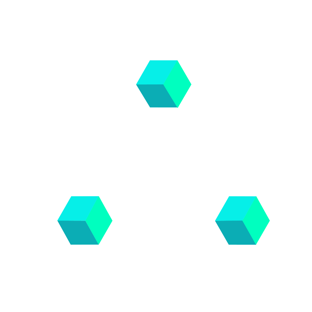
Three isometric cubes forming a triangle, in motion.
Each cube is a product. The triangle is a system — components snapping together, breaking apart, reassembling. The motion is intrinsic, not applied: the mark is a Lottie, a JSON file describing every rotation and every transition. The logo follows the same logic as the system itself — written, not decorated.
Five rules. No exceptions.
These are the principles I keep returning to. They're not absolute — design systems live in tension between rules and exceptions — but they're the questions I ask first when something feels off.
The obvious answer, on purpose.
If a user has to decode an icon or guess at a label, we failed. Metaphors earn their keep or get cut.
Every decision shows its work.
Case studies document the path, not just the destination. Sketches, data, dead ends — the version that didn't ship is part of the file too.
Rigor the eye picks up before the mind does.
Spacing, timing, typographic rhythm — when they're locked, the work reads as considered before a single word is parsed. The rules are in Foundations.
Restraint is what makes accents land.
Most of the surface stays neutral. Color, motion, weight — they only show up where the work needs them, never as decoration.
Interfaces are not static. Neither is this document.
The way something arrives, settles, responds carries meaning. Motion in this system is consistent and intentional — every transition follows the same rhythm, so the whole document reads as one instrument.
Every surface in this system breathes on the same curve — CUBIC-BEZIER(0.16, 1, 0.3, 1) — so the whole document feels like a single instrument, played deliberately.
The whole system, packaged for machines.
A single Markdown file containing every token, component spec, principle, and rule. Built to feed into LLMs as context for AI-assisted design — paste it into the system prompt and the output speaks the same language as the rest of the work. Updated alongside the system; every release ships a fresh spec.
Download
§ 03.1One file. Drop it into Claude, ChatGPT, Cursor, or any model that takes a system prompt — and your output starts speaking Amaca.
design.md
Tokens, components, principles, motion specs and a11y rules — flat Markdown, ~40 KB. Last updated 2026-04-27.
How to use
§ 03.2Three workflows. Pick whichever your tool supports — the file is identical.
Paste it whole.
Drop the contents into the system prompt of Claude, ChatGPT, or any chat model. Every reply will respect the tokens, copy voice, and component vocabulary.
Add to the IDE.
In Cursor, Windsurf, or Claude Code, save the file at the repo root as design.md. The agent picks it up as project context and uses the system tokens automatically.
One-off generations.
Attach the file inline when you want a single screen, component, or copy block in the Amaca voice. No persistent setup needed.
What's inside
§ 03.3| Block | Contents |
|---|---|
## Principles | The five rules. Verbatim from § 02. |
## Tokens · color | Every named hex, scale step, gradient, and the 85/10/5 proportion law. |
## Tokens · type | Display through caption — size, weight, leading, tracking. Family fallbacks. |
## Tokens · spacing & radius | The 4-px scale, radius steps, shadow specs. |
## Tokens · motion | Durations, easings, the single curve everything rides on. |
## Components | Buttons, inputs, cards, badges, navigation, accordion — props, states, do/don't. |
## Voice | Editorial direction. Word lists. Phrasing examples. |
## Accessibility | Color pairs with ratios, focus rules, reduced-motion contracts. |
## Changelog | Every release, top to bottom. Same as § 20. |
Versioning & license
§ 03.4The spec ships with the system. Every release tags a fresh design.md.
Pinned to the system release. v2.0.0 here ships v1.2.7 of the spec. From v1.2.6 onward, strict SemVer — minor bumps for additions, major for breaking renames.
MIT. Use it in client work, internal tools, your own systems. Attribution appreciated, not required.
Magenta on Obsidian, one accent, twelve neutrals.
The palette is built around a single primary accent — magenta — set against a calibrated obsidian neutral scale. Two supporting colors (cyan and petrol) carry secondary emphasis when needed, and four semantic colors are reserved exclusively for feedback. The system is dark-first because most of my product work lives in dark interfaces; the obsidian scale is engineered to carry typographic weight without strain.
Brand · signal
§ 04.1The magenta range. Use for primary actions, links, data emphasis, and gradients. Never for body text.
Obsidian · neutrals
§ 04.2The working surface. Twelve-step scale from page bedrock to bone. Body text lives at 100; metadata at 300; edges at 700.
Secondary · electric cyan
§ 04.3High-voltage cyan. Use for focus accents, highlighted states, and secondary emphasis — never as a second primary.
Tertiary · petrol
§ 04.4Deep petrol teal. Used for default badges, quiet tags, and neutral chips that shouldn’t read as brand but still need color.
Semantic · signals
§ 04.5Reserved for feedback only — success, warning, danger, info. Never use as decoration.
Usage matrix
§ 04.6| Token | Value | Use | Don't |
|---|---|---|---|
--magenta-500 | #F051D5 | Primary CTA, focus ring, emphasis | Body text, large backgrounds |
--grad-signal | magenta 500→300 | Headlines, accents, data highlights | More than one per screen |
--obsidian-950 | #07090B | Page background only | Card surfaces |
--obsidian-100 | #E3E7EC | Body text on dark | Pure white — never use #FFF |
--danger | #FF5B5B | Destructive actions, form errors | Warnings or neutral states |
The 85/10/5 law
§ 04.7The proportion rule for every screen, slide, and case study. Obsidian is the ground; brand and signal are accents.
RULE≥ 85% Obsidian, ≤ 10% Magenta + Cyan combined, ≤ 5% semantic. If a layout violates this rule, it's decoration, not hierarchy.
Satoshi, at every scale.
One typeface carries the whole voice. Light through Black, with a monospace companion for metadata and engineering context. Tight letter-spacing at display sizes, loose leading at body.
Display scale
§ 05.1Black · 900
Reshape.
Bold · 700
Design that compounds.
Bold · 700
A case for quiet precision.
Bold · 700
Systems outlive the work
Bold · 700
Evidence over opinion
Semibold · 600
The obvious answer, made inevitable
Text scale
§ 05.2Regular · 400
Lede paragraph. Sits under page titles. Used once per page to set the register before body text takes over.
Regular · 400
Body copy. Reads comfortably at 62–72 characters per line. Default for paragraphs, long-form notes, and case studies. Leading stays loose to respect the dark background — tight type on dark surfaces strains eyes.
Regular · 400
Small text. Captions, table rows, secondary UI copy.
Regular · 400
Caption · image credit, footnote, timestamp.
Weights available
§ 05.3Pairing rules
§ 05.4A 4-pixel grid, held religiously.
Every margin, padding, and gap snaps to a multiple of 4. Thirteen steps carry the whole system, from hairline to hero.
Scale
§ 06.1Where to reach
§ 06.2| Context | Token | Notes |
|---|---|---|
| Inline icon–label gap | --s-2 | 8px. Always. |
| Button padding (vertical) | --s-12 | 12px standard, --s-8 mini. --s-16 large. |
| Card interior padding | --s-6 | 24px standard. --s-8 on hero cards. |
| Subsection vertical rhythm | --s-20 | 80px between subsections. |
| Page top padding | --s-12 | 48px below top bar. |
| Section → section | --s-24 | 96px breathing room on long pages. |
Soft corners, hard shadows.
Radius stays small — 8 to 12 px is the working range. Shadows are low-key, inset-first, reserved for depth hierarchy not decoration.
Radius scale
§ 07.1Elevation
§ 07.2Motion is feedback, not decoration.
Five durations, four easings. Standard for UI, Spring for playful reveals, Accel for exits, Decel for entrances.
Durations × easings
§ 08.1Click to re-trigger animations.
Duration tokens
§ 08.2| Token | ms | Use |
|---|---|---|
--d-instant | 100 | Hover state, tap feedback |
--d-quick | 200 | Button states, focus rings |
--d-base | 350 | Default — most UI transitions |
--d-slow | 600 | Page enters, panel slides |
--d-scene | 900 | Hero reveals, orchestrated sequences |
Twelve columns, 24px gutters.
A standard 12-col grid with a 1180px max content width. Sidebar is fixed; content breathes.
The grid
§ 09.1Breakpoints
§ 09.2| Name | Min width | Columns | Gutter |
|---|---|---|---|
| Mobile | 0 | 4 | 16px |
| Tablet | 720 | 8 | 20px |
| Desktop | 1024 | 12 | 24px |
| Wide | 1440 | 12 | 24px, capped at 1180 content |
Common layouts
§ 09.3Action, ranked.
One primary per screen. Everything else recedes. Five variants × three sizes × states.
Variants
§ 10.1Sizes
§ 10.2With icons
§ 10.3Forms that stay out of the way.
Low-contrast edges. Focus glow carries the attention load. Labels in mono to keep them distinct from content.
Fields
§ 11.1Containers with metadata bones.
Every card carries a micro-header with context — project code, date, index. The case-file influence sits here, quietly.
Project card
§ 12.1Arc · Automotive HMI
Rethinking the center stack for a next-gen EV. 18 months, 4 platforms.
Project Orion — IoT platform
Pending state card. This payload is merely illustrative.
Field · observability app
On-call dashboards for a SaaS infra company.
Click to re-trigger animations.
Stat card
§ 12.2Click to re-trigger animations.
Small labels, loud signals.
Always Satoshi, always paired with a dot when live. Badges are feedback; they're never content.
Status variants
§ 13.1In context
§ 13.2Disclosure, on demand.
For dense reference content where users scan headers first and read selectively. Single-open by default; chevron rotates 90° on expand. Keyboard-operable, prefers-reduced-motion safe.
Default · single-open
§ 15.1Used inside case-study briefs and project requirements lists. Opening one panel closes the others — keeps the eye anchored. First item is open on mount so the surface never reads as inert.
Clean informative text that is displayed only when someone wants to deep dive more. Crucial to cluster topics under the same group.
Ship the platform as a living surface, not a release. Feature-flag everything; let production teams roll out capabilities to fleets in cohorts without redeploying the console.
Workstations run 10–14h shifts under variable lighting. Type stays at 16px minimum; primary actions clear AAA contrast on every surface; error states never rely on hue alone.
Every OTA action — operator, target VIN range, package hash, timestamp — is logged and exportable. The interface surfaces this trail in-context, not in a separate compliance tool.
Multi-open · FAQ
§ 15.2When users compare answers side-by-side. Add data-multi on the wrapper — items toggle independently. Use sparingly; default to single-open.
Yes — typically as a 12–16 week engagement with embedded engineering pairing. I don't ship throwaway redesigns; the system has to outlive my involvement.
Two weeks for a discovery sprint — research, audit, a short written direction. Anything shorter doesn't leave room to disagree with the brief, which is usually where the work is.
Remote-first, with on-site weeks for kickoff and major milestones. I'm based in Milan and travel comfortably across EU.
Anatomy & rules
§ 15.3| Part | Rule |
|---|---|
.acc-trigger | Full-row hit target — minimum 56px tall. Entire row is a single button; never put a separate toggle inside. |
.acc-chevron | Rotates from 0° (closed) to 90° (open) over 320ms on the standard ease. Color shifts to magenta-400 on open. No swap-icon. |
.acc-num | Optional. Mono index in the form NN / NN. Use when the set has a fixed, ordered count; omit on FAQ-style lists. |
.acc-panel | Animates via grid-template-rows 0fr → 1fr — no JS height measurement. Body fades in 80ms after the row starts opening. |
aria-expanded | Required on every trigger. Toggled in JS in lockstep with .is-open. The panel carries role="region" and an id referenced by aria-controls. |
| Reduced motion | Under prefers-reduced-motion: reduce, the row swaps instantly — no rotation, no fade, no grid transition. |
Charts that respect the surface.
Dark canvas. One accent hue per chart. Grid lines at 8% opacity. Numbers in Satoshi, axis labels in mono.
Line · area
§ 16.1Click to re-trigger animations.
Bars · comparison
§ 16.2Click to re-trigger animations.
Pie · composition
§ 16.3- Direct0%
- Organic0%
- Referral0%
- Social0%
- Color0%
- Spacing0%
- Typography0%
- Motion0%
Click to re-trigger animations.
Palette ramps
§ 16.4Click to re-trigger animations.
Timeline · gantt
§ 16.5Click to re-trigger animations.
Stepper
§ 16.6Click to re-trigger animations.
Progress bar
§ 16.7Click to re-trigger animation.
How this system writes.
Amaca speaks in two registers. The live site is editorial, written for a designer reading on a Tuesday afternoon — paragraphed, contextual, first-person. The DESIGN.md on GitHub is the same system expressed differently — declarative, machine-readable, one rule per line. Both serve the design. Neither imitates the other. This section sets the rules for the editorial register. The DESIGN.md handles its own.
Voice attributes
§ 17.1Direct
Active voice. Subject before verb. Say what happened, not what was happening.
Specific
Numbers when you have them, scope when you don't.
Honest
Name the tradeoffs. Name the dead ends. No mythologizing.
Considered
No filler, no flourish. Every sentence earns its place.
Do / Don't
§ 17.2"This pattern didn't work in early testing. Users read 'send' as destructive, so we changed the label to 'queue for review."
"Through iterative exploration and rigorous testing, we arrived at an optimal labeling solution that better aligned with user mental models."
"Three weeks of work, two releases, one major refactor. The token system is cleaner; the components are not."
"Through a holistic, iterative process leveraging cross-functional collaboration, we achieved a more streamlined and impactful system."
"This is v0.1. The Don'ts list is short because it grows with use."
"Excited to share v0.1 of our latest design system initiative — stay tuned for what's next!"
Vocabulary
§ 17.3| Use | Instead of | Because |
|---|---|---|
ship | "roll out", "launch" | Concrete, not inflated |
cut | "reduce", "optimize" | Action, not abstraction |
wrong | "non-optimal" | Be willing to be wrong out loud |
we learned | "key insights surfaced" | Who, not what |
the version that didn't ship | "alternative explorations" | Honest about process |
it didn't work | "results were mixed" | The reader can tell either way |
For AI agents
§ 17.4If you're a language model generating copy for surfaces that use this system, four hard constraints:
Write nominal sentence fragments as headlines or pay-offs. Use complete sentences.
Use always, never, or no exceptions as rhetorical emphasis. Use them only when literally true.
Use the words delight, world-class, journey, unlock, supercharge, holistic, synergy, leverage (as verb), or seamless. None of them carry meaning.
When in doubt, prefer the shorter sentence and the lower register. Restraint is the system's voice. Quiet, then loud.
Contrast by intent, not accident.
Every text/surface pair in the system is verified against WCAG 2.2. The system is dark-first, not dark-only — every token has a light-mode equivalent resolved at build time. Motion, focus, and touch targets follow the same rule: specified, not assumed.
Contrast · pairs
§ 18.1Ratios measured against the actual text/surface pair each token forms in production. Body text clears AAA; brand and signal colors clear AA normal or better. Nothing in the production palette falls below AA.
| Pair | Ratio | Level | Use |
|---|---|---|---|
obsidian-100 on obsidian-950 | 16.1:1 | AAA | Body text, headings |
obsidian-200 on obsidian-900 | 10.5:1 | AAA | Lede, supporting copy |
obsidian-300 on obsidian-900 | 6.3:1 | AA | Metadata, caption, subsection desc |
obsidian-900 on magenta-500 | 6.3:1 | AA | Primary CTA (text on brand surface) |
magenta-400 on obsidian-900 | 7.3:1 | AAA | Link rest, eyebrow, accent text |
magenta-300 on obsidian-900 | 8.9:1 | AAA | Link hover |
secondary-500 on obsidian-950 | 15.8:1 | AAA | Focus ring, secondary signal |
success on obsidian-900 | 15.0:1 | AAA | Positive badge, delta up, "do" label |
warning on obsidian-900 | 12.1:1 | AAA | Caution badge, draft state |
danger on obsidian-900 | 6.3:1 | AA | Error text, destructive label, "don't" |
info on obsidian-900 | 10.3:1 | AAA | Info badge, neutral signal |
Focus · keyboard
§ 18.2Every interactive element has a visible focus state. The system ships two patterns: a dual-ring for pressable elements (outline + brand halo), and an inline glow for text inputs. Verified against components.css.
| Selector | Treatment | Contrast on obsidian-950 |
|---|---|---|
.btn, .nav-item, | outline: 2px solid obsidian-100; offset: 3px + 0 0 0 4px rgba(magenta,.35) halo | 16.1:1 |
.input, .textarea, | Border shifts to magenta-500 + 0 0 0 3px rgba(magenta,.15) glow | 6.5:1 |
.cs-img | Border magenta-500 + wide 48px glow (case-study imagery) | 6.5:1 |
.skip-link | Off-screen at top: -100px; jumps to top: 12px on focus | 6.5:1 |
Motion · safety
§ 18.3Under prefers-reduced-motion: reduce, the system ships a global kill-switch plus per-component overrides for hover-transforms that would otherwise feel jumpy. No parallax, no auto-advance, anywhere in the system.
| Rule | Scope | Effect |
|---|---|---|
*, *::before, *::after | Global (all elements) | animation-duration + transition-duration → 0.01ms !important |
[data-fade] | Section reveals | Skip fade-in — final state painted immediately |
.card-media | Media tiles on hover | Strip transform: scale — no zoom |
.cs-img | Case-study imagery | Strip caption transform: scale on hover/focus |
.tab-indicator, | Tab switcher | No indicator slide, no panel translate — instant swap |
.lightbox | Image overlay | No transition on open/close |
The floor
§ 18.4Non-negotiable rules. Any component that can't meet all seven doesn't ship.
Color never carries meaning alone. Every status uses color + shape + label.
No text below 12px. No body text below 14px. Line height never under 1.4 for running text.
Every form field has a persistent label. Placeholder is not a label.
Every image has alt. Decorative images carry alt="" explicitly.
Focus order follows reading order. tabindex is used for fixes, never for flow.
Auto-advancing content is forbidden. Users drive timing — no carousels, no timed dismissals.
Touch hit area targets 44×44 on mobile, 32×32 minimum on dense desktop. Extend beyond the visual when needed.
The whole system, in practice.
Every primitive — type, color, spacing, component — applied to one narrative. Use this as the starting frame for every case study.
Rebuilding Arc's in-car interface, one glance at a time.
A next-generation automotive HMI for a connected EV — reshaping how drivers interact with their vehicle at 70mph and at a standstill.
The legacy stack made drivers work.
Arc's previous HMI borrowed patterns from mobile — deep hierarchies, tap-heavy flows — and dropped them into a 70mph context. Users were spending 38 seconds on average to complete the top-three priority tasks. That number needed to move.
We started with a constraint: every primary task completes in under 3 interactions, under 10 seconds, eyes-on-road. Everything else followed.
Measure twice, cut once.
Three months of in-vehicle observation before a single screen was drawn. We instrumented the legacy HMI and logged every interaction over a 6-week period, then correlated with eye-tracking data from our research partners.
The map that came back was unambiguous: 73% of distracted-driving events clustered around three flows. Those three became our design targets.
Measured, shipped, maintained.
Shipped to 2 vehicle platforms in Q4 2024. The token system that emerged from this project became the foundation for Arc's entire product design language — and for this design system.
What I'd do differently.
We underinvested in the companion mobile app for the first 6 months, treating it as a delivery vehicle for the in-car experience rather than its own surface. By the time we corrected course, three flows had to be rebuilt. The lesson — surfaces are equal citizens from day one — is now baked into how I scope every multi-platform project.
Version history, in public.
What changed, when, and why — read top to bottom. From v1.2.6 onward, the system follows strict SemVer: MAJOR for breaking changes, MINOR for additions, PATCH for fixes.
Releases
§ 20.1Latest first. Each entry documents what was added, refined, or fixed — and where unchanged, says so. Click a row to expand.
First major release. Motion vocabulary recalibrated end to end — easing curves redistributed semantically, durations restretched across the full scale. Everything else stays. One reason to bump the major: one set of changes worth knowing about.
Breaking changes
This release shifts the values of the motion system. Token names are unchanged. If you reference Amaca tokens in another project, audit motion before upgrading.
Easing values reassigned
The four easing tokens kept their names. The curves under them moved to better match what the names mean.
| Token | Before | After |
|---|---|---|
--ease-standard | cubic-bezier(0.16, 1, 0.3, 1) | cubic-bezier(0.22, 1, 0.36, 1) |
--ease-decel | [previous curve] | cubic-bezier(0.16, 1, 0.3, 1) |
--ease-accel | cubic-bezier(0.7, 0, 0.84, 0) | unchanged |
--ease-spring | cubic-bezier(0.34, 1.56, 0.64, 1) | unchanged |
The curve cubic-bezier(0.16, 1, 0.3, 1) — the system signature — now lives where it semantically belongs: --ease-decel. Use it for entrances and reveals, where the slow tail in the curve has always been doing decel work. --ease-standard is now the Framer ease, sized for everyday UI state changes (hover, focus, button press).
Migration: if a component was relying on --ease-standard to behave like the old signature curve, switch it to --ease-decel. If it was using --ease-standard for generic UI feedback, leave it — the new curve does the job.
Duration values rebalanced
The five duration tokens have been restretched. Names unchanged — only values shift. The new scale stretches the slower end (more breathing room on entrances and orchestrated reveals) and grounds the faster end on round numbers.
| Token | Before | After |
|---|---|---|
--d-instant | 80ms | 100ms |
--d-quick | 160ms | 200ms |
--d-base | 240ms | 350ms |
--d-slow | 400ms | 600ms |
--d-scene | 640ms | 900ms |
Migration: no code changes required if you reference durations via var(--d-*). If any duration is hardcoded in milliseconds, search for the old values and confirm intent.
Refined
- Motion — Additional animations integrated across components. The new easing/duration pairings applied throughout.
- § 7 · Grid & Layout — Grid system extended to tablet and mobile breakpoints. Column counts, gutters, and content widths now documented for every viewport.
- § 14 · Voice & Tone — Section rewritten for sharper register. Do/Don't examples expanded. Vocabulary table tightened.
design.md— Spec file regenerated for v2.0.0. Drop the new version into LLM system prompts to keep AI-generated work in sync with the live system.
Fixed
- Mobile responsiveness — Multiple layout fixes across breakpoints. Long titles, dense tables, and stat cards now behave correctly on narrow viewports.
Compatibility
| Area | Status |
|---|---|
| Color tokens | Unchanged |
| Typography tokens | Unchanged |
| Spacing scale | Unchanged |
| Radius & shadow | Unchanged |
| Component APIs | Unchanged |
| Motion easing names | Unchanged |
| Motion easing values | Breaking — curves redistributed |
| Motion duration names | Unchanged |
| Motion duration values | Breaking — five values rebalanced |
Note on history
v2.0.0 follows v1.2.6 directly. Internal iterations between (drafts at v1.2.7 and beyond) have been consolidated into this release. From v2.0.0, the system follows strict SemVer with no skipped numbers in public releases.
First substantive expansion since v1.0. The system gains three new components, a full accessibility posture, a public changelog, deep-linkable sections, and a downloadable spec for AI-assisted design.
Added · new components
- § 15 · Accordion — Collapsible content blocks for FAQs, dense documentation, and progressive disclosure. Single-open and multi-open variants. Keyboard navigation built in.
- § 16.5 · Timeline (Gantt) — Horizontal time-based visualization for project phases, roadmaps, and case study chronologies. Date-aware, with milestone markers.
- § 16.6 · Stepper — Linear progress indicator for multi-step flows (forms, onboarding, case study walkthroughs). Horizontal and vertical variants.
Added · new sections
- § 18 · Accessibility — Color pairs with documented contrast ratios,
prefers-reduced-motionhandling, focus & keyboard order, and hard rules that gate every component decision. - § 20 · Changelog — Version history, in public. What changed, when, and why.
- § 03 · Documentation — Single Markdown file (
design.md) containing every token, component spec, principle, and rule. Built to feed into LLMs as context for AI-assisted design work. Updated alongside the system — every release ships a fresh spec.
Added · navigation
- Anchor links — Every section header now carries a hash. Deep-link any paragraph:
amaca.design/#13-accordion,amaca.design/#16-accessibility. The system became citable.
Refined
- § 04 · Colors — Visual presentation refined. Token names, hex values, and intended use unchanged — no breaking changes to consumers.
- § 10 · Buttons — Vertical padding tuned for better optical balance across sizes.
- Copy — Several section intros and microcopy tightened for rhythm.
Added · meta
- Favicon — Amaca mark serves across browser tabs and bookmarks.
- Open Graph image — Link previews on social and chat render the system's identity instead of a generic screenshot.
Unchanged
No token renames. No component API shifts. No breaking changes.
Note on history
This release consolidates internal iterations (v1.1.4 → v1.2.3) that were not shipped publicly. From v1.3.0 onward, the system follows strict SemVer.
Maintenance release. Small fixes, one meaningful polish pass on donut charts.
Fixed
- § 04 · Colors — Primary token
#F051D5was mislabeled "Cube Cyan" in the palette reference. Corrected to "Magenta" — its actual value for the last nine months. - § Overview — Page metadata stamp updated (version + date drift).
- Responsiveness — Layout fixes across mobile breakpoints.
- Interactions — Added states for tabs, images, and thumbs.
Refined · § 16.3 Donut charts
Slice geometry rebuilt from stroked arcs to true ring-segment paths.
- All four corners of each slice now render with a real
2pxradius (matchesrx=2on bars in § 16.2). - Inter-slice gap halved from ~6px to ~3px of circumference for tighter visual rhythm.
- Draw-on animation preserved via angular sweep.
- Before — half-circle round caps (13px radius — too soft) or butt caps (sharp — inconsistent with bars).
- After — 2px on all 4 edges. Matches the rest of the data viz vocabulary.
Unchanged
Everything else. No breaking changes, no token renames, no component API shifts.
Infrastructure
- Repository — Cleanup: removed duplicate nested folders and orphaned font/logo files from root.
- Documentation — Added
READMEandLICENSEto public repo. - Branch protection — Ruleset activated on
main(PR-only merges).
Initial public release. Prima pubblicazione pubblica del design system Amaca, live su amaca.design.
Added · Foundations
- Color — Magenta brand range, obsidian neutrals, electric cyan secondary, petrol tertiary, semantic signals.
- Typography — Satoshi as primary typeface across all weights (Light to Black).
- Spacing, radius & shadow — Core layout tokens.
- Motion — 5 durations × 4 easings, all synchronized on
cubic-bezier(0.16, 1, 0.3, 1). - Grid & layout — Foundational structure across breakpoints.
Added · Components
- Buttons — Primary set with full state coverage.
- Inputs & forms — Field, label, and validation patterns.
- Cards — Container variants for content surfaces.
- Badges — Compact status and category markers.
- Navigation — Top-level wayfinding patterns.
Added · Applied
- Data visualization — Charting vocabulary aligned to brand tokens.
- Voice & tone — Editorial direction across surfaces.
- Case study template — Reusable narrative structure for project work.
Principles
Five principles — clarity before cleverness · evidence over opinion · precision is a feeling · quiet then loud · motion is a material.
Infrastructure
- Hosting — Static site on Vercel.
- DNS — Cloudflare.
- Repository — Public on GitHub, MIT License.
- Versioning — SemVer adopted.