Design products that reshape the future.
Motion-first. AI-readable. Built in the open.
Amaca is my personal design system. It started as a side project — a place to practice the kind of system I'd been wanting to build for years (full story here). It's grown into something more specific: a design system where motion is a foundation, not a finish, and where every rule is written so an AI agent can read and apply it as cleanly as a human can.
What's inside
§ 01.1Hard tokens
The tokens everything else is built from. Color, type, spacing, motion, and the rules that hold them together.
Build blocks
The primitives I reach for when designing a product surface. Buttons, forms, cards, and the patterns that emerge from them.
In practice
How the system performs in practice. Data viz, voice, accessibility, and a worked case study template using every primitive in the kit.
The mark
§ 01.2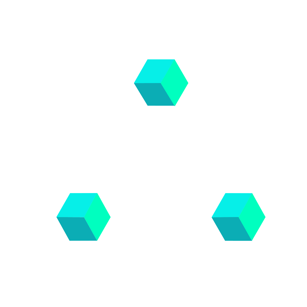
Three isometric cubes forming a triangle, in motion.
Each cube is a product. The triangle is a system — components snapping together, breaking apart, reassembling. The motion is intrinsic, not applied: the mark is a Lottie, a JSON file describing every rotation and every transition. The logo follows the same logic as the system itself — written, not decorated.
Five rules. Exceptions earn their keep.
These are the principles I keep returning to. They're not absolute — design systems live in tension between rules and exceptions — but they're the questions I ask first when something feels off.
The obvious answer, on purpose.
If a user has to decode an icon or guess at a label, we failed. Metaphors earn their keep or get cut.
Every decision shows its work.
Case studies document the path, not just the destination. Sketches, data, dead ends — the version that didn't ship is part of the file too.
Rigor the eye picks up before the mind does.
Spacing, timing, typographic rhythm — when they're locked, the work reads as considered before a single word is parsed. The rules are in Foundations.
Restraint is what makes accents land.
Most of the surface stays neutral. Color, motion, weight — they only show up where the work needs them, never as decoration.
Interfaces are not static. Neither is this document.
The way something arrives, settles, responds carries meaning. Motion in this system is consistent and intentional — every transition follows the same rhythm, so the whole document reads as one instrument.
Every entrance in this system breathes on the same curve — CUBIC-BEZIER(0.16, 1, 0.3, 1), the signature ease, living at --ease-decel since v2.0.0 — so the whole document feels like a single instrument, played deliberately.
Your design system, compiled for every tool.
Pick your tool, grab the file — or the turnkey .zip — and drop it in. Every download is token-only: it makes any AI reference your tokens by name instead of inventing values. Same source on every surface — the spec is DESIGN.md, the tokens are tokens.css / tokens.dtcg.json. MIT.
Pick your tool
§ 03.0Start with the three on top, or jump to your stack. One download per tool — a small bundle with the file, the tokens/spec it needs, and a usage README inside.
Claude — skill + CLAUDE.md
The rules as a Claude skill (tokens bundled) + a CLAUDE.md for Claude Code.
amaca-frontend.skillFigma — /amaca-figma skill
In-canvas custom skill: builds with Amaca Variables, audits what landed on canvas, repairs in a verify loop. Fetch-first — it never invents values.
amaca-figma.mdGoogle design.md
The spec in the Google Labs design.md standard — paste into Stitch's project box.
DESIGN.mdAGENTS.md
One repo-root file read natively by 28+ agents (Codex, Cursor, Copilot, Windsurf, Aider…).
ChatGPT · Gemini
Self-contained paste-in with the token values inlined — no companion files.
Cursor · Copilot
.cursor/rules/amaca.mdc (auto-attaches on UI files) + .github/copilot-instructions.md.
v0 · Lovable · Base44
Same self-contained paste-in — these builders have no filesystem.
Tailwind v4 @theme
Every token as a @theme block — generates bg-magenta-500, p-4, rounded-lg.
Raw CSS variables
tokens.css (vars + reset) + components.css — var(--token) everywhere, no build step.
DTCG pipeline
Tokens as W3C DTCG JSON — stable 2025.10 format — for Style Dictionary, Tokens Studio, any DTCG-aware build.
How to install
§ 03.1Per-runtime. Pick the row that matches your tool — the first three mirror the hero cards above.
-
01 · COWORK / CLAUDE CODE
ANY ANTHROPIC RUNTIMEDrop the .skill bundle in.
Settings → Capabilities → Skills → upload
amaca-frontend.skill. Restart the session. Invoke withamaca-frontendor just describe an Amaca task — the skill auto-triggers on context. -
02 · FIGMA
— AGENT SKILLInstall it like the Claude skill, invoke /amaca-figma.
In any Figma file: prompt box → attachment icon → Skills → Add skill → upload
amaca-figma.md. Then/amaca-figma: it fetches the live spec first, generates with Amaca Variables, and self-audits in a verify loop — or audits a selection on canvas evidence. Code-side sync (tokens pushed as Variables over the Figma MCP) stays available through theamaca-frontendskill. -
03 · GOOGLE STITCH
— DESIGN.MDPaste the spec into the project box.
Download
DESIGN.md— the spec ships in the Google Labsdesign.mdstandard. On Stitch's Start with your project screen, paste it into the existing DESIGN.md box (or upload the file). Pick the most capable model for brand fidelity.Frontier-tier model required. On lighter models the spec is read as passive context, not instructions — see § 03.3 capability tiers.
-
04 · CURSOR / VS CODE / WINDSURF · CONTINUE / AIDER
— EDITORS & ASSISTANTSDrop the spec at your tool's rules path.
These read markdown rules from your repo. Unzip
amaca-ide.zipat the repo root — since v3.1.0 it ships core + per-target rules, attached only to the files they govern:- Cursor
.cursor/rules/amaca-core.mdc · amaca-html.mdc · amaca-react.mdc - VS Code (Copilot)
.github/copilot-instructions.md + instructions/amaca-*.instructions.md - Windsurf
.windsurf/rules/amaca.md - Aider
CONVENTIONS.md - Continuerules in config
The runtime reads it as instructions and grounds on the spec.
Model-gated — fidelity tracks the model behind the editor. See § 03.3.
- Cursor
-
05 · GEMINI ADVANCED
— GEMSSpec as knowledge, instructions as system prompt.
Create a new Gem. Paste the SKILL.md body (without YAML frontmatter) into Instructions. Upload DESIGN.md as the Gem's knowledge file. Save. That Gem now speaks Amaca for any frontend task.
Frontier-tier model required. On lighter models the spec is read as passive context, not instructions — see § 03.3 capability tiers.
-
06 · CHATGPT
— CUSTOM GPTSame pattern as Gems.
Create a Custom GPT. SKILL.md body as instructions. DESIGN.md as knowledge file. Same result.
Frontier-tier model required. On lighter models the spec is read as passive context, not instructions — see § 03.3 capability tiers.
-
07 · ONE-OFF
ANY LLM CHATAttach and prefix.
Drop DESIGN.md inline in the chat. Prefix your prompt with "Use this as the canonical reference for tokens, components, and voice — generate strictly compliant frontend code." Lighter than the skill but works when nothing else does.
Frontier-tier model required. On lighter models the spec is read as passive context, not instructions — see § 03.3 capability tiers.
-
08 · REPLIT / LOVABLE / V0 / BOLT / BASE44
— APP BUILDERSFeed the tokens, not the skill.
Prompt-to-app builders impose their own stack (usually React + Tailwind + shadcn) and treat a pasted spec as soft context. Give them the Tailwind
@themetokens as the project foundation — those travel; the enforcement workflow does not. Replit is closest (its Agent reads project files — drop a rules file). Base44 is the tightest (locked stack). Compliance is model- and platform-gated: a frontier model + tokens-as-foundation gets most of the way — verify with the § 03.3 scan.
What's inside the spec
§ 03.2The DESIGN.md the skill bundles, and the raw download serves, is organized in the Google design.md grammar:
| Block | Contents |
|---|---|
## Overview | How to use the file, quick reference, token roles in the YAML front-matter. |
## Colors | Every named hex, scale step, gradient, and the 85/10/5 proportion law. |
## Typography | Display through caption — size, weight, leading, tracking. Family fallbacks. |
## Layout · Shapes · Elevation | The 4-px scale, radius steps, shadow specs. |
## Motion | Durations, easings, the single curve everything rides on. |
## Components | Buttons, forms, cards, badges, navigation, accordion, chat, loader, diagrams, checkbox, select — props, states, do/don't. |
## Do's and Don'ts | The five principles, the anti-patterns, and the rules for AI agents. Voice included. |
## Accessibility | Color pairs with ratios, focus rules, reduced-motion contracts. |
## Changelog | Every release, top to bottom. Same as § 24.1. |
Model capability tier
§ 03.3 · what to expectThe skill encodes a 7-step workflow and 14 verification checks. Whether the runtime model executes them rigorously depends on its reasoning capacity, instruction-following fidelity, and how it grounds on uploaded files.
Production-grade enforcement.
Claude Opus 4.x, Claude Sonnet 4.x, GPT-5, Gemini 3 Pro. Explicit tool calls to read DESIGN.md, syntactic token registry checks, gap-surfacing protocol invoked correctly, voice register maintained.
Validated empirically: Gemini 3.1 Pro held strict Amaca compliance on a design-tool runtime.
Usable output, partial compliance.
Claude Haiku, GPT-5 mini, Gemini 3 Flash. Token references are mostly canonical, principles are cited, structure is sound. Expect two weaknesses:
- 01Class name proliferation. New classes where canonical components would compose.
- 02Micro-inconsistencies. Radius drift, occasional minor token substitution, edge cases on multi-component composition.
#XXXXXX instead of var(--color)), raw px values (16px instead of var(--s-4)), raw duration literals (600ms instead of var(--d-*) — ratified continuous loops are the only exception), --ease-spring on effect properties (color, background, opacity, shadow — § 08.3 RIGID), new .classname introductions outside the canonical § 3 registry, and missing @media (prefers-reduced-motion: reduce) overrides. Catches most drift regardless of model tier.
magenta-500 (#F051D5) defaults to obsidian-950 — 6.5:1, AA. One ratified exception (v2.6.0, § 6.3): .btn-primary carries obsidian-050 at ≈2.8:1 — kept on perceptual grounds, scoped to that selector only. Every other magenta fill — chips, badges, non-button CTAs — stays dark-text.
Beyond model size, the runtime's file-grounding architecture matters. Anthropic-stack tools (Claude Code, Cowork, Cursor with Claude, Continue with Claude) read uploaded files via explicit tool calls — what you upload is what gets read. Consumer chat tools that abstract file uploads as context embeddings may produce performative compliance: the model announces reading DESIGN.md but the actual grounding is shallow.
For non-Anthropic runtimes the most reliable deployment is the platform's custom-assistant wrapper — Gemini Gems, ChatGPT Custom GPT — where instructions and knowledge files load at session level, not per-message context.
React — native
§ 03.4Tailwind v4 @theme is native: tokens become first-class utilities (bg-magenta-500, rounded-md) straight from tokens.css — no Google spec, no build hack. React is first-class in amaca-frontend v1.1.
bg-magenta-500 · text-obsidian-950 · rounded-md
Every token resolves to a utility class against the same var() chain the CSS surface uses. No CSS modules, no translation layer.
@import "amaca-design/styles/theme.css";
One line wires the full token scale into a Tailwind v4 project. theme.css is a @theme projection of tokens.css — var() aliases, no duplicated literals.
design.md / W3C DTCG
tokens.json
The Google design.md / W3C DTCG export stays available as an optional, generated projection for lint, diff, and cross-tool interop — not the thing that unlocks React. Same one-way model: derived from tokens.css, not authored separately.
Versioning & license
§ 03.5Two SemVer streams, one rule each.
Pinned to the system release — the version in the site header is the version of the spec this page ships. Strict SemVer from v1.2.0 onward — minor bumps for additions, major for breaking renames.
Decoupled from spec version. The skill's own SemVer covers workflow changes — new posture rules, verification checks, deploy targets. v1.1.9 re-bundles on the current spec — multi-target across HTML, React, and Figma, and teaches the stat count-up motion rule. The in-canvas Figma skill (amaca-figma) versions separately.
Use it in client work, internal tools, your own systems. Attribution appreciated, not required.
Magenta on Obsidian, one accent, twelve neutrals.
The palette is built around a single primary accent — magenta — set against a calibrated obsidian neutral scale. Two supporting colors (cyan and petrol) carry secondary emphasis when needed, and four semantic colors are reserved exclusively for feedback. The system is dark-first because most of my product work lives in dark interfaces; the obsidian scale is engineered to carry typographic weight without strain.
Brand · signal
§ 04.1The magenta range. Use for primary actions, links, data emphasis, and gradients. Never for body text.
Obsidian · neutrals
§ 04.2The working surface. Twelve-step scale from page bedrock to bone. Body text lives at 100; metadata at 300; edges at 700.
Secondary · electric cyan
§ 04.3High-voltage cyan. Use for focus accents, highlighted states, and secondary emphasis — never as a second primary.
Tertiary · petrol
§ 04.4Deep petrol teal. Used for default badges, quiet tags, and neutral chips that shouldn’t read as brand but still need color.
Semantic · signals
§ 04.5Reserved for feedback only — success, warning, danger, info. Never use as decoration.
Usage matrix
§ 04.6| Token | Value | Use | Don't |
|---|---|---|---|
--magenta-500 | #F051D5 | Primary CTA, focus ring, emphasis | Body text, large backgrounds |
--grad-signal | magenta 500→300 | Headlines, accents, data highlights | More than one per screen |
--obsidian-950 | #07090B | Page background only | Card surfaces |
--obsidian-100 | #E3E7EC | Body text on dark | Pure white — never use #FFF |
--danger | #FF5B5B | Destructive actions, form errors | Warnings or neutral states |
The 85/10/5 law
§ 04.7The proportion rule for every screen, slide, and case study. Obsidian is the ground; brand and signal are accents.
RULE≥ 85% Obsidian, ≤ 10% Magenta + Cyan combined, ≤ 5% semantic. If a layout violates this rule, it's decoration, not hierarchy.
Satoshi, at every scale.
One typeface carries the whole voice. Light through Black, with a monospace companion for metadata and engineering context. Tight letter-spacing at display sizes, loose leading at body.
Display scale
§ 05.1Black · 900
Reshape.
Bold · 700
Design that compounds.
Bold · 700
A case for quiet precision.
Bold · 700
Systems outlive the work
Bold · 700
Evidence over opinion
Semibold · 600
The obvious answer, made inevitable
Text scale
§ 05.2Regular · 400
Lede paragraph. Sits under page titles. Used once per page to set the register before body text takes over.
Regular · 400
Body copy. Reads comfortably at 62–72 characters per line. Default for paragraphs, long-form notes, and case studies. Leading stays loose to respect the dark background — tight type on dark surfaces strains eyes.
Regular · 400
Small text. Captions, table rows, secondary UI copy.
Regular · 400
Caption · image credit, footnote, timestamp.
Weights available
§ 05.3Pairing rules
§ 05.4A 4-pixel grid, held religiously.
Every margin, padding, and gap snaps to a multiple of 4. Thirteen steps carry the whole system, from hairline to hero.
Scale
§ 06.1Where to reach
§ 06.2| Context | Token | Notes |
|---|---|---|
| Inline icon–label gap | --s-2 | 8px. Always. |
| Button padding (vertical) | --s-12 | 12px standard, --s-8 mini. --s-16 large. |
| Card interior padding | --s-6 | 24px standard. --s-8 on hero cards. |
| Subsection vertical rhythm | --s-20 | 80px between subsections. |
| Page top padding | --s-12 | 48px below top bar. |
| Section → section | --s-24 | 96px breathing room on long pages. |
Soft corners, hard shadows.
Radius stays small — 8 to 12 px is the working range. Shadows are low-key, inset-first, reserved for depth hierarchy not decoration.
Radius scale
§ 07.1Elevation
§ 07.2Motion is feedback, not decoration.
Six durations, four easings. Standard for UI, Spring for playful reveals, Accel for exits, Decel for entrances, Draw for data reveals.
Durations × easings
§ 08.1Click to re-trigger animations.
Duration tokens
§ 08.2| Token | ms | Use |
|---|---|---|
--d-instant | 100 | Hover state, tap feedback |
--d-quick | 200 | Button states, focus rings |
--d-base | 350 | Default — most UI transitions |
--d-slow | 600 | Page enters, panel slides |
--d-scene | 900 | Hero reveals, orchestrated sequences |
--d-draw | 1200 | Chart draw-on, count-up, progressive data reveals |
Stat count-up is a RIGID rule: numeric stats and KPIs compose from zero to their target riding --d-draw · --ease-decel and land exactly on the final value; under reduced motion they jump straight to it.
Easing tokens & pairing
§ 08.3| Token | Curve | Use |
|---|---|---|
--ease-standard | cubic-bezier(0.22, 1, 0.36, 1) | Default for user-triggered states — hover, press, focus |
--ease-accel | cubic-bezier(0.7, 0, 0.84, 0) | Exits, dismissals |
--ease-decel | cubic-bezier(0.16, 1, 0.3, 1) | Default for system-triggered transitions — entrances, reveals. The system signature |
--ease-spring | cubic-bezier(0.34, 1.56, 0.64, 1) | Pop-in, delight, overshoot — spatial properties only |
The trigger decides the pairing: user-triggered states ride --d-quick · --ease-standard; system-triggered transitions — content entering, leaving, or moving without a direct pointer cause — ride --d-base · --ease-decel.
Spatial vs Effects is a RIGID rule: every animated property has a type, and the type gates the easing. Spatial properties — transform, position, size, shape — may use any easing, including --ease-spring. Effect properties — color, background, opacity, shadow — use no-overshoot curves only; --ease-spring on an effect property is off-system, and greppable per line.
Motion per component
§ 08.4Every component that moves documents its motion in one fixed schema — same four columns everywhere, no prose specs. The Motion column accepts token pairs only; the Property column declares the type (spatial / effect) so the rule above is checkable on the row itself; the Reduced motion column uses a closed vocabulary — instant · fade-only · none — recording only how the component lands when the global kill-switch (§ 21.3) fires.
| Component | Trigger | Property (type) | Motion | Reduced motion |
|---|---|---|---|---|
Entrance reveal [data-fade] | enter viewport | opacity (effect) · translateY 12px→0 (spatial) | --d-slow · --ease-decel | instant |
| Accordion | open / close | panel grid-rows (spatial) · chevron rotate 90° (spatial) | --d-base · --ease-decel | instant |
| Accordion | open | panel body opacity (effect) | --d-quick · --ease-decel · delay 80ms | instant |
| Accordion | hover / open state | trigger + chevron color (effect) | --d-quick · --ease-decel | instant |
| Tabs | select | indicator transform + width (spatial) | --d-base · --ease-decel | instant |
| Tabs | panel switch | panel opacity (effect) · translateY 6px→0 (spatial) | --d-quick · --ease-standard | instant |
| Card | hover | border-color · box-shadow (effect) | --d-quick · --ease-standard | instant |
| Lightbox | open / close | backdrop + content opacity (effect) — no scale-in | --d-quick · --ease-standard | instant |
| Chat | message enter · container | scale 0.92→1 (spatial) | --d-base · --ease-spring | instant |
| Chat | message enter · container | opacity (effect) | --d-base · --ease-standard | instant |
| Chat | message enter · content | opacity (effect) · translateY 3px→0 (spatial) | --d-quick · --ease-standard · delay 80ms | instant |
| Chat | roll-off .is-out | opacity (effect) · translateY −8px (spatial) | --d-quick · --ease-accel | instant — still hides |
| Chat | roll-off .is-out | max-height + margin collapse (spatial) | --d-base · --ease-accel | instant — still hides |
| Chat | typing dots (loop) | translateY 0→−4px→0 (spatial) · opacity (effect) | --d-slow · --ease-standard · stagger 0/160/320ms | instant — rest state |
| Chat | send idle → ready | background + color (effect) | --d-quick · --ease-standard | instant |
| Loader | success | check scale-in (spatial) · anim fade + scale 0.7 (spatial/effect) | --d-base · --ease-spring | instant |
| Loader | skeleton handoff | loader → skeleton swap | after a --d-scene wait | instant swap, shimmer disabled |
| Diagrams | enter viewport · nodes | opacity (effect) | --d-base · --ease-decel · stagger ~70ms | instant — straight to resolved |
| Diagrams | enter viewport · edges + clusters | opacity (effect) | --d-base · --ease-decel · after nodes, +40ms each | instant — straight to resolved |
| Stat / KPI | enter viewport | text content count-up 0→target (effect) | --d-draw · --ease-decel | instant — jump to final |
| Loader | wait (loop) | brand mark GIF (spatial) | media clock (GIF/Lottie) · infinite | hidden — fallback ring shown |
| Loader | wait (loop) | fallback ring rotate (spatial) | 1400ms · linear · infinite | ratified exception — keeps spinning |
| Loader | label cycle (loop) | label opacity crossfade (effect) | 2400ms cycle · 200ms crossfade | instant swap |
| Skeleton | wait (loop) | shimmer sweep (effect) | 1600ms · linear · infinite | disabled |
| A11y caret (demo) | idle (loop) | caret opacity blink (effect) | 1s · steps(1) · infinite | stopped by the kill-switch |
Seeded with the site-canonical patterns; every new component ships its rows here — and in DESIGN.md § Motion — in the same release. Continuous loops are a ratified class: they run while the component is mounted, on per-component literal clocks — the --d-* scale describes perceived transitions, not idle rhythm. Mechanical loops ride linear (or steps), never an easing curve; every loop is ratified by its own loop row above, and a loop literal without a row is drift — the raw-duration grep exception covers exactly this list, nothing else.
Twelve columns, 24px gutters.
A standard 12-col grid with a 1180px max content width. Sidebar is fixed; content breathes.
The grid
§ 09.1Breakpoints
§ 09.2| Name | Min width | Columns | Gutter |
|---|---|---|---|
| Mobile | 0 | 4 | 16px |
| Tablet | 720 | 8 | 20px |
| Desktop | 1024 | 12 | 24px |
| Wide | 1440 | 12 | 24px, capped at 1180 content |
Common layouts
§ 09.3Action, ranked.
One primary per screen. Everything else recedes. Five variants × three sizes × states.
Variants
§ 10.1Sizes
§ 10.2With icons
§ 10.3Forms that stay out of the way.
Low-contrast edges. Focus glow carries the attention load. Labels in mono to keep them distinct from content.
Fields
§ 11.1Time input
§ 11.2HH:MM, 24h. Auto-formats as you type — the colon is inserted after the second digit, and each position is bounded so an invalid time is impossible to enter. No type="time": the native picker doesn't respect the system.
2
H2max 3 if H1 = 2, else 0–9
M1max 5
M20–9
maxlength="5"+inputmode="numeric"are required.- The
:is inserted automatically — users only type digits. - Optional by default; can be marked required per context.
- Focus & error states inherit from § 11.1.
Date input
§ 11.3DD/MM/YYYY, single date. Typed input is digit-by-digit masked (slashes auto-insert) and the trailing icon opens a calendar popover that stays in sync. No native type="date" — the browser picker doesn't respect the system. Optional min/max attributes constrain both the typed value and the picker.
2026-05-01 → 2026-12-31.
3
D2max 1 if D1 = 3; if D1 = 0, must be 1–9; else 0–9
M1max 1
M2max 2 if M1 = 1; if M1 = 0, must be 1–9; else 0–9
Y1–40–9
maxlength="10"+inputmode="numeric"required.- Slashes are inserted automatically — users only type digits.
- Real-date check (e.g. 31/02 rejected) runs on blur, not while typing.
data-min&data-maxin ISOYYYY-MM-DD; both optional.- Trailing icon & ↓ on the input both open the picker.
- Locale: English month/day labels, week starts Monday.
- Single date only. For range selection, see § 11.4.
Date range
§ 11.4Two coupled inputs sharing one popover. Two months side-by-side on desktop, stacked on mobile. Click 1 sets the start, click 2 sets the end — clicking before start swaps. Footer presets cover the analytics defaults; the helper line auto-counts inclusive days.
- Click 1 → start. Hover preview shows tentative range.
- Click 2 ≥ start → commits end.
- Click 2 < start → swaps (becomes new start).
- Same-day click twice → single-day range.
- Esc → cancel pending selection & close.
- Two inputs:
data-range-start&data-range-endinside adata-range-groupwrapper. - Same digit-by-digit mask as § 11.3.
- Popover anchors to the start input. 580px wide, collapses to 280px stacked under 600px viewport.
- Helper auto-renders
N days(inclusive count) on commit. data-min&data-maxon either input bound the whole range.
Containers with metadata bones.
Every card carries a micro-header with context — project code, date, index. The case-file influence sits here, quietly.
Project card
§ 12.1Arc · Automotive HMI
Rethinking the center stack for a next-gen EV. 18 months, 4 platforms.
Project Orion — IoT platform
Pending state card. This payload is merely illustrative.
Field · observability app
On-call dashboards for a SaaS infra company.
Click to re-trigger animations.
Stat card
§ 12.2Click to re-trigger animations.
Small labels, loud signals.
Always Satoshi, always paired with a dot when live. Badges are feedback; they're never content.
Status variants
§ 13.1In context
§ 13.2Disclosure, on demand.
For dense reference content where users scan headers first and read selectively. Single-open by default; chevron rotates 90° on expand. Keyboard-operable, prefers-reduced-motion safe.
Default · single-open
§ 15.1Used inside case-study briefs and project requirements lists. Opening one panel closes the others — keeps the eye anchored. First item is open on mount so the surface never reads as inert.
Clean informative text that is displayed only when someone wants to deep dive more. Crucial to cluster topics under the same group.
Ship the platform as a living surface, not a release. Feature-flag everything; let production teams roll out capabilities to fleets in cohorts without redeploying the console.
Workstations run 10–14h shifts under variable lighting. Type stays at 16px minimum; primary actions clear AAA contrast on every surface; error states never rely on hue alone.
Every OTA action — operator, target VIN range, package hash, timestamp — is logged and exportable. The interface surfaces this trail in-context, not in a separate compliance tool.
Multi-open · FAQ
§ 15.2When users compare answers side-by-side. Add data-multi on the wrapper — items toggle independently. Use sparingly; default to single-open.
Yes — typically as a 12–16 week engagement with embedded engineering pairing. I don't ship throwaway redesigns; the system has to outlive my involvement.
Two weeks for a discovery sprint — research, audit, a short written direction. Anything shorter doesn't leave room to disagree with the brief, which is usually where the work is.
Remote-first, with on-site weeks for kickoff and major milestones. I'm based in Milan and travel comfortably across EU.
Anatomy & rules
§ 15.3| Part | Rule |
|---|---|
.acc-trigger | Full-row hit target — minimum 56px tall. Entire row is a single button; never put a separate toggle inside. |
.acc-chevron | Rotates from 0° (closed) to 90° (open) over 320ms on the standard ease. Color shifts to magenta-400 on open. No swap-icon. |
.acc-num | Optional. Mono index in the form NN / NN. Use when the set has a fixed, ordered count; omit on FAQ-style lists. |
.acc-panel | Animates via grid-template-rows 0fr → 1fr — no JS height measurement. Body fades in 80ms after the row starts opening. |
aria-expanded | Required on every trigger. Toggled in JS in lockstep with .is-open. The panel carries role="region" and an id referenced by aria-controls. |
| Reduced motion | Under prefers-reduced-motion: reduce, the row swaps instantly — no rotation, no fade, no grid transition. |
Conversations that earn their bubbles.
A chatbot interface lives or dies on cadence. Bubbles land with a small spring overshoot, typing indicators promise a reply, and the conversation never overcrowds the surface — older messages roll off after three exchanges. Own bubbles use --magenta-700 (deep brand), so --magenta-500 stays reserved for CTAs and focus.
Anatomy
§ 16.1Uniform --r-lg (12px) on all four corners — no tail. Avatar appears only on the first bubble of a bot streak; subsequent bot bubbles get a 32px invisible spacer so the column stays aligned. Own bubbles fill with --magenta-700, the deep brand accent — the brighter --magenta-500 stays reserved for primary actions elsewhere in the system.
Live demo
§ 16.2Three scripted exchanges with a chatbot. Each turn: typing indicator first, then the bubble lands. After the third exchange completes, older messages roll off the top so the surface never overcrowds. Hit replay to restart.
Composer
§ 16.3Textarea expands from 36px to 132px before scrolling. Send is dim while empty; lights up magenta on first keystroke. Attach is ghost-styled, hover only. Enter sends; ⇧ Enter inserts a newline.
Motion spec
§ 16.4Every transition resolves to a token, in the canonical § 08.4 grammar. Two-stage bubble entry: the container scales from 0.92 with an --ease-spring overshoot (spatial only — the opacity rides --ease-standard), then the inner content fades up 80ms behind.
| Trigger | Property (type) | Motion | Reduced motion |
|---|---|---|---|
message enter · container .chat-bubble | scale 0.92→1 (spatial) | --d-base · --ease-spring | instant |
| message enter · container | opacity (effect) | --d-base · --ease-standard | instant |
message enter · content .chat-bubble-content | opacity (effect) · translateY 3px→0 (spatial) | --d-quick · --ease-standard · delay 80ms | instant |
roll-off .chat-msg.is-out | opacity (effect) · translateY −8px (spatial) | --d-quick · --ease-accel | instant — still hides |
roll-off .chat-msg.is-out | max-height + margin collapse (spatial) | --d-base · --ease-accel | instant — still hides |
typing dots .chat-dot (loop) | translateY 0→−4px→0 (spatial) · opacity (effect) | --d-slow · --ease-standard · stagger 0/160/320ms | instant — rest state |
send idle → ready .chat-composer-send | background + color (effect) | --d-quick · --ease-standard | instant |
Do / Don't
§ 16.5Anti-patterns surfaced from early chatbot builds. Most are 85/10/5 violations dressed up as enthusiasm.
Own bubbles fill with --magenta-700 — the deep brand accent. Bright --magenta-500 stays reserved for CTAs and focus rings.
Paint own bubbles with --magenta-500. The bubble starts reading as a CTA and the actual primary action on the page loses its weight.
Anchor the typing indicator inside a bot bubble — same shape, same surface, same column. The reader's eye stays where the next message will land.
Float "Amaca is typing…" as a gutter caption below the conversation. For a single-bot UI it's noise; the avatar already says who's typing.
Show the avatar only on the first bot bubble of a streak. The rest of the streak gets a 32px invisible spacer so the column stays aligned.
Repeat the avatar on every bot bubble. It hijacks the eye and steals the budget from content.
Roll older messages off the top after the conversation passes ~3 exchanges. Fade up + collapse in --d-quick on --ease-accel.
Let the demo grow unbounded. A demo that fills the viewport buries the motion you're trying to document.
The logo, in motion as a promise.
A loader is a contract: something is happening, don't leave. The Amaca logo carries that contract at four scales — inside a button, beside an input, over a card, across the viewport. Under prefers-reduced-motion the Lottie steps aside and a single magenta ring spins in its place.
Scale
§ 17.1Four sizes, four tokens. The Lottie scales linearly — the file is vector. Hit-area follows the box exactly; no extra padding.
Variants
§ 17.2Five shapes for five waits. The standalone is the floor; everything else composes from it. Success swaps the Lottie for a check on --ease-spring when the wait resolves green.
Compositions
§ 17.3Four real-world placements. Click any Trigger to start the wait, watch the loader hold the surface, then resolve.
A submit handler is in flight. The button stays the same size; the label crossfades to the loader so layout never shifts.
Anatomy
§ 17.4Tokenized spacing between logo and label, padding on overlay variants, alpha on the backdrop. Each measurement maps to a system token — no raw px in component code.
Do / Don't
§ 17.5A loader has a job. If it isn't communicating a real wait, it's decoration — and decoration on a brand mark dilutes the mark.
Show the loader within 100ms of the action that triggered the wait. Late loaders read as a glitch, not feedback.
Pop the loader after the response already returned. A 200ms wait deserves no loader at all — show the result.
One full-page loader per route at a time. After 800ms hand off to skeleton frames so the page reads as structurally present.
Stack a section loader inside a card that already sits inside a full-page loader. The user can't tell which wait is which.
Pair every loader with an accessible name — aria-label on the loader root or a visible label. Screen readers announce role=status politely.
Use the loader as a decorative animation in the corner of a hero. The mark is in motion because something is loading — never because the page is.
Resolve to the success state when a wait completes green — the checkmark crossfades in over the logo on --ease-spring and the live region announces.
Let the loader keep spinning after the wait is over. A loader that won't stop is a bug surface, not a state.
Structure, drawn on the same grid.
Flowcharts and system maps from a textual source — auto-laid-out, then themed entirely from tokens. The library only ever sees values read off :root at runtime, so there is no hardcoded hex anywhere: the single source of truth stays tokens.css. Everything is neutral obsidian; exactly one magenta node marks the narrative entry. On scroll, nodes cascade in, then the edges that connect them.
Flowchart · node-edge
§ 18.1Decisions and paths. Rectangles are steps, diamonds are gates, dashed edges are loops. One magenta node — the entry — anchors where to start reading. Everything else recedes to obsidian.
System architecture · grouped
§ 18.2Box-and-line with grouping. Subgraphs become clusters — --obsidian-850 fill, --obsidian-700 border — so related boxes read as one zone. The one magenta node is the source of truth every surface derives from.
Semantic states · legend
§ 18.3The one case for color beyond magenta. When a node encodes a real state, it carries the semantic hue — but never alone: every state node also changes shape and spells the state in its label (§ 6 floor #1). A legend maps each pairing.
Anatomy
§ 18.4A <figure class="diagram"> wraps a .diagram-canvas[role="img"] (holding the rendered SVG) and a .diagram-caption. Surface, border, and radius are coherent with .card. Semantic-state diagrams add a .diagram-legend.
| Class | Role |
|---|---|
.diagram | Figure shell. --obsidian-900 surface, 1px --obsidian-700 border, --r-lg, --s-6 padding — the .card frame. |
.diagram-canvas | Render target. Carries role="img" + a descriptive aria-label; the library injects the SVG here. A textual source sits in a <template class="diagram-src"> until render. |
.diagram-caption | Mono micro, --obsidian-400, FIG-NN · title — echoes .card-meta. The index tints --magenta-400. |
.diagram-legend | Optional. Only on semantic-state diagrams. Each row pairs a shape swatch + a written label — color never carries meaning alone. |
Token map — applied through themeVariables populated from getComputedStyle(:root), plus classDef strings built from the same tokens at runtime. The theming config holds zero hex literals.
| Element | Token |
|---|---|
| Canvas / background | --obsidian-900 |
| Node fill | --obsidian-800 |
| Node border · text | --obsidian-600 · --obsidian-100 |
| Edge line + arrowhead | --obsidian-500 |
| Edge label | --obsidian-300 on --obsidian-900 |
| Cluster fill · border | --obsidian-850 · --obsidian-700 |
| Node radius · font | --r-md · Satoshi (--font-sans) |
| Focus node border | --magenta-500 · one per diagram |
| State nodes | --success · --warning · --danger |
Motion spec
§ 18.5Entrance reuses the system's established reveal patterns — nothing new, in the canonical § 08.4 grammar. An IntersectionObserver fires once (threshold 0.15, rootMargin 0px 0px -8% 0px, unobserve after fire); nodes cascade in, then edges and clusters. Opacity only: transforms on the generated SVG <g> groups compose with the cascade and break the auto-layout positioning. The hook runs after the async render resolves, not on first paint.
| Trigger | Property (type) | Motion | Reduced motion |
|---|---|---|---|
| enter viewport · nodes | opacity (effect) | --d-base · --ease-decel · stagger ~70ms | instant — straight to resolved |
| enter viewport · edges + clusters | opacity (effect) | --d-base · --ease-decel · after nodes, +40ms each | instant — straight to resolved |
Do / Don't
§ 18.6A diagram is structure, not decoration. Most of these are 85/10/5 violations or auto-layout breakers.
Keep every node neutral obsidian and spend the magenta once — on the entry or the narrative focus. One accent per diagram is the budget.
Color nodes by category with a per-type rainbow palette. The hues stop meaning anything and the surface goes loud.
Read tokens from :root at runtime and feed them to themeVariables and classDef. The source of truth stays tokens.css.
Paste hex literals into themeVariables. A copied #0B0E12 drifts the moment a token moves — it's a regression on day one.
Animate the entrance with opacity only, gated on an IntersectionObserver that fires once after render resolves.
Apply CSS transform to the SVG <g> groups. It composes with the auto-layout transforms and the diagram falls apart — set position via the SVG attribute, animate opacity only.
When a node encodes a real state, pair the semantic color with a distinct shape and a written label, and add a legend.
Fill nodes with gradients or bleed a diffuse magenta glow down the edges. Depth comes from token borders, never from decoration.
Charts that respect the surface.
Dark canvas. One accent hue per chart. Grid lines at 8% opacity. Numbers in Satoshi, axis labels in mono.
Line · area
§ 19.1Click to re-trigger animations.
Bars · comparison
§ 19.2Click to re-trigger animations.
Pie · composition
§ 19.3- Direct0%
- Organic0%
- Referral0%
- Social0%
- Color0%
- Spacing0%
- Typography0%
- Motion0%
Click to re-trigger animations.
Palette ramps
§ 19.4Click to re-trigger animations.
Timeline · gantt
§ 19.5Click to re-trigger animations.
Stepper
§ 19.6Click to re-trigger animations.
Progress bar
§ 19.7Click to re-trigger animation.
Geographic · hex map
§ 19.8A dot-density world drawn as a honeycomb. The landmass isn't hand-drawn: it's the public-domain Natural Earth 1:110m dataset (loaded as TopoJSON via world-atlas), rasterised into the hex grid by canvas sampling — the canonical d3 dotted-map pipeline — and every node is placed at its true longitude / latitude. The land is a single neutral obsidian fill — quiet, the 85% — so the status hexes are the only thing that reads as data. Every fill is a token, no hardcoded hex; color is always paired with a label in the legend (§ 6 #1).
One accent set, paired with labels — the landmass never competes. Hover lights the grid cell-by-cell; otherwise static — no auto-advance, no decorative loop (§ 6 #6).
How this system writes.
Amaca speaks in two registers. The live site is editorial, written for a designer reading on a Tuesday afternoon — paragraphed, contextual, first-person. The DESIGN.md on GitHub is the same system expressed differently — declarative, machine-readable, one rule per line. Both serve the design. Neither imitates the other. This section sets the rules for the editorial register. The DESIGN.md handles its own.
Voice attributes
§ 20.1Direct
Active voice. Subject before verb. Say what happened, not what was happening.
Specific
Numbers when you have them, scope when you don't.
Honest
Name the tradeoffs. Name the dead ends. No mythologizing.
Considered
No filler, no flourish. Every sentence earns its place.
Do / Don't
§ 20.2"This pattern didn't work in early testing. Users read 'send' as destructive, so we changed the label to 'queue for review."
"Through iterative exploration and rigorous testing, we arrived at an optimal labeling solution that better aligned with user mental models."
"Three weeks of work, two releases, one major refactor. The token system is cleaner; the components are not."
"Through a holistic, iterative process leveraging cross-functional collaboration, we achieved a more streamlined and impactful system."
"This is v0.1. The Don'ts list is short because it grows with use."
"Excited to share v0.1 of our latest design system initiative — stay tuned for what's next!"
Vocabulary
§ 20.3| Use | Instead of | Because |
|---|---|---|
ship | "roll out", "launch" | Concrete, not inflated |
cut | "reduce", "optimize" | Action, not abstraction |
wrong | "non-optimal" | Be willing to be wrong out loud |
we learned | "key insights surfaced" | Who, not what |
the version that didn't ship | "alternative explorations" | Honest about process |
it didn't work | "results were mixed" | The reader can tell either way |
For AI agents
§ 20.4If you're a language model generating copy for surfaces that use this system, four hard constraints:
When in doubt, prefer the shorter sentence and the lower register. Restraint is the system's voice. Quiet, then loud.
Write nominal sentence fragments as headlines or pay-offs. Use complete sentences.
Use always, never, or no exceptions as rhetorical emphasis. Use them only when literally true.
Use the words delight, world-class, journey, unlock, supercharge, holistic, synergy, leverage (as verb), or seamless. None of them carry meaning.
Contrast by intent, not accident.
Every text/surface pair in the system is verified against WCAG 2.2. The system is dark-first, not dark-only — every token has a light-mode equivalent resolved at build time. Motion, focus, and touch targets follow the same rule: specified, not assumed.
Contrast · pairs
§ 21.1Ratios measured against the actual text/surface pair each token forms in production. Body text clears AAA; brand and signal colors clear AA normal or better. One pair sits below AA by ratified exception — the primary button label, documented below and in the v2.6.0 release.
| Pair | Ratio | Level | Use |
|---|---|---|---|
obsidian-100 on obsidian-950 | 16.1:1 | AAA | Body text, headings |
obsidian-200 on obsidian-900 | 10.5:1 | AAA | Lede, supporting copy |
obsidian-300 on obsidian-900 | 6.3:1 | AA | Metadata, caption, subsection desc |
obsidian-050 on magenta-500 | ≈2.8:1 | EXC* | Primary button label (ratified v2.6.0) |
obsidian-950 on magenta-500 | 6.5:1 | AA | Default for every other magenta fill |
magenta-400 on obsidian-900 | 7.3:1 | AAA | Link rest, eyebrow, accent text |
magenta-300 on obsidian-900 | 8.9:1 | AAA | Link hover |
secondary-500 on obsidian-950 | 15.8:1 | AAA | Focus ring, secondary signal |
success on obsidian-900 | 15.0:1 | AAA | Positive badge, delta up, "do" label |
warning on obsidian-900 | 12.1:1 | AAA | Caution badge, draft state |
danger on obsidian-900 | 6.3:1 | AA | Error text, destructive label, "don't" |
info on obsidian-900 | 10.3:1 | AAA | Info badge, neutral signal |
* Ratified exception, § 6.3: below the 4.5:1 AA bar, kept on perceptual grounds — on high-chroma magenta, near-white separates more cleanly than the higher-contrast dark label. Scoped to .btn-primary only. Under APCA (the WCAG 3 candidate method) the ranking inverts: the light label scores Lc 55.8 vs 47.4 for the dark one — the perceptual model agrees.
Focus · keyboard
§ 21.2Every interactive element has a visible focus state. The system ships two patterns: a dual-ring for pressable elements (outline + brand halo), and an inline glow for text inputs. Verified against components.css.
| Selector | Treatment | Contrast on obsidian-950 |
|---|---|---|
.btn, .nav-item, | outline: 2px solid obsidian-100; offset: 3px + 0 0 0 4px rgba(magenta,.35) halo | 16.1:1 |
.input, .textarea, | Border shifts to magenta-500 + 0 0 0 3px rgba(magenta,.15) glow | 6.5:1 |
.cs-img | Border magenta-500 + wide 48px glow (case-study imagery) | 6.5:1 |
.skip-link | Off-screen at top: -100px; jumps to top: 12px on focus | 6.5:1 |
Motion · safety
§ 21.3Under prefers-reduced-motion: reduce, the system ships a global kill-switch plus per-component overrides for hover-transforms that would otherwise feel jumpy. No parallax, no auto-advance, anywhere in the system.
| Rule | Scope | Effect |
|---|---|---|
*, *::before, *::after | Global (all elements) | animation-duration + transition-duration → 0.01ms !important |
[data-fade] | Section reveals | Skip fade-in — final state painted immediately |
.card-media | Media tiles on hover | Strip transform: scale — no zoom |
.cs-img | Case-study imagery | Strip caption transform: scale on hover/focus |
.tab-indicator, | Tab switcher | No indicator slide, no panel translate — instant swap |
.lightbox | Image overlay | No transition on open/close |
window.__motion gate | Motion One — cards, data viz, counters | JS animations jump to final state; counters land on target |
The floor
§ 21.4Non-negotiable rules. Any component that can't meet all seven doesn't ship.
Color never carries meaning alone. Every status uses color + shape + label.
No text below 12px. No body text below 14px. Line height never under 1.4 for running text.
Every form field has a persistent label. Placeholder is not a label.
Every image has alt. Decorative images carry alt="" explicitly.
Focus order follows reading order. tabindex is used for fixes, never for flow.
Auto-advancing content is forbidden. Users drive timing — no carousels, no timed dismissals.
Touch hit area targets 44×44 on mobile, 32×32 minimum on dense desktop. Extend beyond the visual when needed.
The whole system, in practice.
Every primitive — type, color, spacing, component — applied to one narrative. Use this as the starting frame for every case study.
Rebuilding Arc's in-car interface, one glance at a time.
A next-generation automotive HMI for a connected EV — reshaping how drivers interact with their vehicle at 70mph and at a standstill.
The legacy stack made drivers work.
Arc's previous HMI borrowed patterns from mobile — deep hierarchies, tap-heavy flows — and dropped them into a 70mph context. Users were spending 38 seconds on average to complete the top-three priority tasks. That number needed to move.
We started with a constraint: every primary task completes in under 3 interactions, under 10 seconds, eyes-on-road. Everything else followed.
Measure twice, cut once.
Three months of in-vehicle observation before a single screen was drawn. We instrumented the legacy HMI and logged every interaction over a 6-week period, then correlated with eye-tracking data from our research partners.
The map that came back was unambiguous: 73% of distracted-driving events clustered around three flows. Those three became our design targets.
Measured, shipped, maintained.
Shipped to 2 vehicle platforms in Q4 2024. The token system that emerged from this project became the foundation for Arc's entire product design language — and for this design system.
What I'd do differently.
We underinvested in the companion mobile app for the first 6 months, treating it as a delivery vehicle for the in-car experience rather than its own surface. By the time we corrected course, three flows had to be rebuilt. The lesson — surfaces are equal citizens from day one — is now baked into how I scope every multi-platform project.
Slides that hold the system.
Eight canonical layouts on a fixed 1920×1080 canvas. Same tokens, same 85/10/5 restraint as every other surface — the deck just happens to be 16:9. One magenta moment per slide; everything else stays obsidian.
The deck
§ 23.1A worked 8-slide deck — the Arc HMI case study, told on-system. Navigate with the controls, the dots, or the ← / → arrow keys. No auto-advance (a11y floor #6); position is remembered across reloads.
Layouts
§ 23.2The eight templates, authored at full 1920×1080 and scaled to fit. Each is a single .slide with a layout modifier; the chrome (brand, footer, page number) is shared across all of them.
AmacaAmacaAmacaAmacaAmacaAmacaAmacaAmacaAnatomy
§ 23.3Every slide is authored in a 1920×1080 coordinate space, then scaled to whatever container holds it. The chrome and safe margins are constant so a deck reads as one object.
| Part | Spec |
|---|---|
.slide canvas | 1920×1080, 16:9, surface --obsidian-950. Scaled via transform: scale(), never reflowed. |
| Safe margin | 120px left/right, 88px top/bottom (--pad-x / --pad-y). Content lives inside. |
.slide-brand | Top-left lockup — logo mark + “Amaca” wordmark. Present on every slide. |
.slide-foot | Footer rail — project · date (left), page NN / total (right). Mono, --obsidian-400; the live page index tints --magenta-400. |
| Type | Its own optical scale — the UI scale (§ 05) is tuned for an 1180px column, not a 1920px canvas. Titles 64–150px, body 30px, mono chrome 20–24px. |
| Accent | ≤5% magenta — one keyword, one numeral, or the eyebrow rule. The rest is obsidian (§ 08). |
Layout modifiers — each is a single class on .slide:
| Class | Use |
|---|---|
.slide--cover | Title / opening |
.slide--divider | Section divider with ghosted numeral |
.slide--content | Title + body copy |
.slide--split | Two-column — heading + metadata list |
.slide--stat | One oversized metric |
.slide--data | Chart slide (Data Viz vocabulary) |
.slide--image | Full-bleed media + scrim + caption |
.slide--closing | Sign-off / contact |
Rules
§ 23.4Spend one magenta moment per slide — a keyword, a numeral, or the eyebrow rule. Everything else stays obsidian (85/10/5).
Flood a slide background with a magenta gradient or tint more than one element. That reads as decoration, not signal.
Keep the 1920×1080 canvas fixed and scale it. Nav controls live outside the scaled frame so they stay usable at any size.
Auto-advance the deck or loop decorative motion. Navigation is manual — arrow keys, controls, or dots (a11y floor #6).
Version history, in public.
What changed, when, and why — read top to bottom. From v1.2.0 onward, the system follows strict SemVer: MAJOR for breaking changes, MINOR for additions, PATCH for fixes.
Releases
§ 24.1Latest first. Each entry documents what was added, refined, or fixed — and where unchanged, says so. Click a row to expand.
MINOR. The motion documentation becomes homogeneous: one fixed grammar for every component that moves, two new RIGID rules, and the anti-drift net extended to catch what it couldn't see. Shaped by a comparative research pass across M3 Expressive, Figma, Carbon, Atlassian, Fluent 2, Polaris and the DTCG standard. No token value changes.
New · Motion grammar (§ 08.3–08.4)
- Spatial vs Effects (RIGID) — every animated property has a type, and the type gates the easing: spatial (transform, position, size, shape) may ride any curve including
--ease-spring; effect (color, background, opacity, shadow) never overshoots. Mechanically greppable, per line. - Trigger-based pairing — user-triggered states ride
--d-quick·--ease-standard; system-triggered transitions ride--d-base·--ease-decel. The trigger decides, not taste. - Per-component motion schema — one fixed four-column table (trigger · property+type · token pair · reduced-motion, closed vocabulary
instant/fade-only/none) replaces prose specs. Card, Accordion, Tabs, Lightbox, Chat, Loader and Diagrams migrated; § 16.4 and § 18.5 converted to the canonical columns. - Motion index — the aggregate of every ratified per-component spec, in § 08.4 and DESIGN.md § Motion: the system's whole choreography in one table.
- Continuous loops (ratified class) — loops run while mounted, on per-component literal clocks,
linear/stepsonly, each ratified by its own index row (brand mark, fallback ring, label cycle, shimmer, caret). The raw-duration grep exception is now a closed list. - § 08.3 Easing tokens — the four curves get their own table on the site (they lived only in DESIGN.md and the demo), each with intent annotation on the row.
Changed · Enforcement
The grep audit, the anti-patterns table and AI-agent rule #6 now catch raw ms durations (ratified loops excepted) and --ease-spring on effect properties. Propagated to every download surface: AI-INSTRUCTIONS, CLAUDE.md, AGENTS.md, Copilot/Cursor rules, llms-full.txt; amaca-figma reaches v1.4 (check 8 gains the Spatial/Effects RIGID); the amaca-frontend bundle re-bakes with the pairing section and new checks (H8, R10, F9–F10), and FIGMA.md v1.1 maps the motion scale to Figma's native Timing and Easing variable types.
Fixed
- Vercel Web Analytics — the tracking snippet (PR #9, May 12) was lost in a later
index.htmlrewrite; the site shipped without it and the dashboard read zero. Re-added before</body>. - Token drift, three survivors —
[data-fade]rode a raw600ms→--d-slow; the law-card bar rode a raw bezier →--ease-standardand a1100msclip-path →--d-draw, closing the last off-scale draw-on literal the v2.7.0 audit had missed. - Changelog renumbered to strict SemVer — v2.4.1 → v2.4.0, v1.2.6 → v1.2.0, v1.1.4 → v1.1.0: the first release of each line is now X.Y.0, consolidation notes and COMPARE links updated. The public sequence has no skipped numbers.
- § Overview metadata stamp — read Version 3.1.0 · Jul 6 while the system shipped 3.2.0: realigned, and the release checklist in DESIGN.md § Versioning now names it explicitly so it can't drift again.
Trigger
The foundations lived in § 08 but per-component motion rules were scattered across component sections with no uniform grammar — the exact pathology a machine-readable system can't afford. A verified research pass over how the leading systems structure motion (spring schemes, composite tokens, intent annotations, kill-switch contracts) shaped the schema; the strongest patterns — Atlassian's intent bundles, M3's spatial/effects taxonomy, Polaris's per-token guidance — landed as Amaca rules.
MINOR. The system reaches the Figma canvas: an in-canvas custom skill for the Figma agent, on the Agent Skills single-file standard. No token, value, or component contract changed.
New · Figma agent skill — /amaca-figma
- Two entry points — generate builds on canvas binding Amaca-named Variables; audit lints a selection on canvas evidence: bindings, token existence, the 85/10/5 budget, contrast pairs, the component registry, type and spacing scale.
- Verify loop — audit runs after every generate; repairs target only the flagged nodes, capped at two passes. A finding that survives a repair is treated as a system gap and routed to the gap protocol, not another loop.
- Fetch-first, fail-stop — the skill reads
/llms-full.txtbefore any action and refuses to generate from memory. It never invents a hex, px, or easing. - Install — in a Figma file: prompt box → Skills → Add skill → upload
amaca-figma.md→ invoke/amaca-figma. Ships asdownloads/amaca-figma.md+zips/amaca-figma.zip.
New · Motion rule — stat count-up (RIGID)
Numeric stats and KPI values count up from zero to the target on entrance (--d-draw · --ease-decel) and land exactly on the final value; under reduced motion they jump straight to it. Already the site's counter behavior — now normative in § 08 for every deploy target, taught by the amaca-frontend targets (v1.1.9) and audited by /amaca-figma (check 10).
Changed · downloads grid (§ 03.0)
- Hero swap — the Figma card takes the second hero slot;
AGENTS.mdmoves to the top of the AI integrations column. Its bundle is unchanged. - Builders card — Figma Make hands off to the dedicated Figma card; the row now reads v0 · Lovable · Base44. Same paste-in bundle (
amaca-appbuilder.zip), contents unchanged. - § 03 instructions reconciled — the install rows now mirror the hero cards: the Figma row teaches the in-canvas skill (install like Claude, invoke
/amaca-figma) and a Google Stitch row is added; the IDE row reflects the v3.1.0 core + per-target layout; the spec-contents table speaks the design.md grammar; versioning cards refreshed (CURRENT v1.1.9); subsection numbering closed (03.1–03.5, was 03.2–03.6). tokens.dtcg.json→ DTCG stable 2025.10 — colors as colorSpace/components objects (hex kept as fallback), dimensions and durations as value+unit objects, easings as cubicBezier arrays, shadows structured, font stacks as arrays. Repairs in passing: two gradient tokens re-typed from cubicBezier to other,font-monocorrected to the ui-monospace stack, em letter-spacing kept as strings (dimension is px|rem only). The draft-format file remains in git history.llms-full.txtversion stamp — the self-contained context file now declares the spec version and release date it was baked from, so fetch-first consumers (this skill included) can echo what they loaded.
Trigger
Post-Config 2026 the Figma agent accepts custom skills on the same Agent Skills standard this repo already targets — the deliverable is loadable as-is. Occupying the in-canvas surface extends multi-deploy to where designers work. The skill is advisory by nature (the agent is non-deterministic); the deterministic gate remains the amaca-frontend bundle.
MINOR. Two amaca.design-side parity moves — no token, value, or component contract changed. The flagship now ships what the amaca.ai compiler emits.
New · IDE download — core + per-target rules
- Cursor split — the single
.cursor/rules/amaca.mdcis replaced byamaca-core.mdc(alwaysApply: true— token discipline, the laws, the a11y floor) plus glob-scopedamaca-html.mdc(CSS/HTML) andamaca-react.mdc(JSX/TSX, Tailwind v4@theme). The core stays loaded everywhere; the heavy target rules attach only to the files they govern. - Copilot per-target —
.github/copilot-instructions.md(repo-wide) plus.github/instructions/amaca-{html,react}.instructions.mdwithapplyToglobs. - Canonical targets —
html · react · figma. Figma is a Variables deploy, not a glob target, so it carries no.mdc.
New · site /llms.txt
- Curated AI index —
/llms.txtpoints agents at the docs worth reading (DESIGN.md, tokens.css, theme.css, tokens.dtcg.json, AGENTS.md) by absolute URL, plus a self-contained/llms-full.txtwith the rules and full token table inlined. Read by Cursor, Copilot, and Claude/Perplexity in retrieval. robots.txt+sitemap.xml— permissive crawl policy that names the AI/LLM crawlers (GPTBot, OAI-SearchBot, ChatGPT-User, ClaudeBot, Claude-Web, PerplexityBot, Google-Extended) as allowed so/llms.txtis never moot, plus a sitemap listing/and/DESIGN.md. Independent layers fromllms.txt(access + search vs inference-time index).
Changed · downloads
- App-builder bundle split out — the App-builder card (Figma Make · v0 · Lovable · Base44 · Bolt) now downloads its own
amaca-appbuilder.zipinstead of sharingamaca-chat.zip, so the two no longer collide as one filename. Both ship the same self-containedAI-INSTRUCTIONS.mdpaste-in, baked from one source viabuild-paste-in-bundles.sh— edit once, both stay in sync.
Trigger
Reconciling the hand-authored gold against the compiler's current output surfaced two gaps: the IDE download was a single rule file where the product emits core + per-target, and the site had no hosted llms.txt. Closing those pulled in the adjacent AI-surface hygiene (robots/sitemap) and a download-naming dedupe (App-builder). All close to parity — the flagship eats its own output.
MAJOR. A document-grammar break, not a token change. DESIGN.md is rewritten to the Google Labs design.md open standard — the eight canonical sections in order plus a structured front-matter token block — so any conforming consumer (Stitch, an agent, the amaca-compiler conformance lint) reads it as a valid design.md by construction, not by omission. No token, value, or component contract changed; every screen renders identically to v2.8.0.
Changed
- Eight canonical sections — Overview · Colors · Typography · Layout · Elevation & Depth · Shapes · Components · Do's and Don'ts, in that order. The old numbered sections fold in: Principles / Voice / 85·10·5 / Anti-patterns → Do's and Don'ts; the token sub-sections → Colors / Typography / Layout / Elevation & Depth / Shapes; component specs → Components.
- Structured front-matter — Machine-readable
colors:(with an explicitprimary: #F051D5role + the full obsidian/magenta scales),typography:,spacing:,rounded:. Theprimaryrole is the load-bearing bit: without it a consumer can regenerate the palette and ignore the brand. - Extension sections, preserved — Motion, Iconography, Accessibility, Code conventions, Multi-deploy and IDE integration are kept verbatim as marked extension sections after the canonical eight — the richness the standard has no slot for, lint-safe.
Migration
Section numbers changed. In-prose cross-references written as "§ N.M" now point to the same content under its new home (e.g. former § 3.10 Dropdown → Components → Dropdown / Select; § 6.3 → Accessibility → Ratified exceptions; § 2.8 → Motion). A migration note in the spec changelog carries the mapping.
Trigger
amaca.design is the dogfood for amaca-compiler: what the site ships should equal what the compiler emits when it ingests this system. The compiler's output already conforms to the Google design.md grammar — so the hand-authored spec was restructured to the same standard, written at its best. The site is now the maximal-compliant instance, not a bespoke doc the lint can't read.
Also shipped in 3.0.0
- New component · Presentations — slide-deck templates (a fixed 1920×1080 canvas scaled to 16:9, eight layouts), with a live demo deck + layout gallery in Applied. Slide pieces enter on the system's staggered-reveal motion: numeric values count up, listed rows choreograph one at a time, data bars wipe in.
- Downloads · "Pick your tool" — your design system compiled for every tool: a Claude skill +
CLAUDE.md, the universalAGENTS.md, Googledesign.md, IDE rules (Cursor.mdc/ Copilot), a self-contained paste-in for ChatGPT/Gemini/builders, and the token formats (Tailwind@theme, raw CSS, DTCG). One turnkey bundle per tool, each with a usage README inside. - Data Viz · interactive hex world map (§ 19.8) — the public-domain Natural Earth 1:110m land rasterised into a token-styled honeycomb (d3-geo + world-atlas), status nodes placed at true longitude/latitude, click-to-inspect node card, labeled legend.
MINOR. One component refinement: the custom listbox now places itself so it never covers the content it sits above.
Changed · Dropdown / Select
- Viewport-aware placement (variant B) — The custom listbox opens below the trigger and flips above when there isn't room, clamps its
max-heightto the available space (internal scroll) and clamps horizontally — so the menu never covers adjacent content (e.g. a chat composer the control sits above).position:fixedmeasured from the trigger's rect when near a viewport edge; the oldposition:absolute; top:calc(100% + 4px)stays valid only when there's always room below. - Native
<select>(variant A) discouraged directly above content — The browser/OS renders the option popup over the control and can cover what's beneath it; near a viewport edge or above must-see content, reach for variant B. - Dismissal extended — A fixed-position menu also closes on
scrollandresize(its anchored coordinates would otherwise drift from the trigger).
Trigger
A native <select> sitting just above a chat composer covered the input with its option popup. The fix is a placement contract, ratified into § Components → Dropdown / Select, that any control near a viewport edge or above must-see content follows.
PATCH. A ratified no-change: the primary button label was evaluated at three weights and stays Medium 500 — documented so the decision has a date and a rationale, not just a habit.
Ratified
- § 3.1 · Primary label weight — Compared Regular 400, Medium 500 and Bold 700 in context (15px and 13px scales). Under APCA stroke weight is a contrast input and 700 scores strongest — but the bold label shifts the button's voice, and the legibility budget is already carried by the § 6.3 pairing. Medium 500 holds: don't bold the primary label for emphasis, don't drop below 500. Noted in the § 6.3 APCA evidence so the question doesn't reopen.
- System constraint, recorded — Satoshi ships no SemiBold cut:
font-weight: 600silently resolves to Bold 700. The real choice on this system is 500 vs 700.
Skill
Bundle re-baked as v1.1.5 on this spec; HTML.md's a11y note carries the weight rule.
Trigger
Follow-up to the v2.7.1 APCA work: would a semibold label improve accessibility? WCAG 2 is weight-blind, APCA rewards weight, the system has no 600 cut — a side-by-side evaluation closed the question in Medium's favor.
PATCH. Documentation and one token-value refinement. The floor's only ratified exception (§ 6.3, primary button label) gets quantified with the WCAG 3 candidate method — and the perceptual model agrees with the choice.
Fixed
- § 6.3 · APCA evidence — Under APCA the ranking inverts:
--obsidian-050on--magenta-500scores Lc 55.8 vs 47.4 for the dark label. WCAG 2.x under-estimates light text on saturated mid-tone fills (the "orange button" failure mode). Added with it: the ceiling note (4.5:1 is unreachable on #F051D5 — pure white tops at 3.07:1) and a compliance mode for AA-contractual contexts (dark-label variant, on request, never default). - Ratio honesty — The declared ≈3.0:1 was the measured 2.83. Corrected to ≈2.8:1 in every living section (§ 3.1, § 6.1, § 6.3 spec · § 03.4, § 21.1 site). Historical changelog untouched.
- § 21.1 · EXC badge — Dropped the warning tint: the asterisk already marks the exception, and semantic colors are feedback-only (§ 04.5) — a documentation badge reading as an alarm was off-doctrine.
- ::selection literal —
tokens.csscarriedcolor:#fff, contradicting the no-#FFF rule and § 6.3's "near-white" description of the precedent. Nowvar(--obsidian-050). - § 7.3 · Runtime-token anti-drift, codified — Live in two domains (Mermaid theming § 18, the
window.__motionhelper) but missing as a general rule. Now canonical in code conventions: tokens read off:rootat every JS boundary; a hand-copied value is a regression.
Skill
Bundle re-baked as v1.1.4 on this spec; HTML.md's a11y note carries the APCA evidence and the measured ratio. Release rule, now standing: every relevant DS change ships into the skill in the same release.
Trigger
An accessibility question — is there an accessible non-pure white on magenta-500? — led to measuring the exception with both models. No light color can pass WCAG 2 on this fill; APCA inverts the ranking in the light label's favor. The floor's only exception is now its most evidence-based section.
MINOR. A motion audit (2026-06-11) found the system's animations running on six engines with two structural leaks: Motion One blocks duplicated easing values as literals and escaped the reduced-motion kill-switch, and chart draw-on choreography lived off-scale. This release closes both — one new token, zero new engines.
Added · tokens
- --d-draw · 1200ms — Sixth duration. Data draw-on: chart tracing, count-up, progressive data reveals. The scale topped out at
--d-scene(900ms, hero reveals), but a line tracing itself or a number counting up is a different semantic category — data revealing, not UI entering — and lives naturally at 1.2s. Projected to Tailwind asduration-drawviatheme.css.
Fixed · motion integrity
- Motion tokens, one source — The Motion One module now reads
--d-*and--ease-*off:rootat runtime and hands them to consumers (same pattern § 18 uses for color). The hand-copied easing arrays in cards (§ 12) and data viz (§ 19) are gone — if a token moves, the JS follows. The v2.0.0 lesson, finally encoded. - Reduced-motion gate for Motion One — The § 21.3 CSS kill-switch can't reach WAAPI/JS animation. Every
animate()call is now gated: underprefers-reduced-motion: reduceit jumps straight to the final state and counters land on their target. Cards and data viz — the most animated surfaces in the system — were the only blocks without a JS check. - Durations snapped to scale — Data viz literals (0.5 / 0.7 / 0.75 / 0.9 / 1.2 / 1.4s) now resolve to tokens: draw-on and count-up ride
--d-draw, baseline sweeps ride--d-scene, bar and ramp reveals ride--d-slow. Choreography delays and staggers stay literal by design — they are composition, not vocabulary. - § 08 demo fallback —
playMotionfell back tocubic-bezier(0.2, 0.8, 0.2, 1)— a curve that exists nowhere in the system — and 240ms, the pre-v2.0.0 base. Now reads--ease-standardand--d-quickoff:root.
Trigger
An external motion audit read every animation path in the codebase and found the virtuous pattern — tokens read off :root at runtime — already canonized in § 18, while the Motion One blocks next to it still carried hand-copied values. Extending the system's own best pattern to its most animated surfaces is the whole release.
PATCH. Documentation-only. The accessibility exception ratified in v2.6.0 (§ 3.1 primary button label) is now reflected everywhere the old rule survived. No token changes, no component API breaks — every screen renders identically to v2.6.0.
Fixed
- § 03.4 · A11Y floor — Rewritten. The old note required
obsidian-950on every magenta fill and called light text a failure; it now states the dark-text default and documents the single ratified exception, scoped to.btn-primary. - § 21.1 · Contrast pairs — The
obsidian-900onmagenta-500row described the pre-v2.6.0 button. Replaced with two rows:obsidian-050onmagenta-500(≈3.0:1, ratified exception, primary button label) andobsidian-950onmagenta-500(6.5:1, AA, default for every other magenta fill). Section lede updated — "nothing falls below AA" is no longer literally true, so it no longer says it. - § 02 · Principles heading — "Five rules. No exceptions." violated § 20.4 (no exceptions as rhetorical emphasis) and, after v2.6.0, was literally false. Retitled: "Five rules. Exceptions earn their keep."
- § 02 · Signature curve copy — Still claimed every surface rides
cubic-bezier(0.16, 1, 0.3, 1); since v2.0.0 that curve lives at--ease-deceland--ease-standardis the Framer ease. The copy now says what the tokens say. - § 03 · Skill references — The docs described the skill as v1.1.0, 6 steps, 13 checks; the shipped bundle is two releases ahead — 7 steps and 14 checks since v1.1. All § 03 references reconciled, and the bundle re-baked as v1.1.2 on the v2.6.1 spec so the download matches the page that describes it.
- styles/theme.css — v2.5.0 declared it shipped; it never reached the repo. It now exists: a Tailwind v4
@themeprojection oftokens.css—var()aliases, zero duplicated literals, same-name tokens (--font-*,--ease-*) declared@theme inlineto avoid circular aliases. Verified against a real Tailwind v4 build: 21/21 utilities generate. One spec correction landed with it: the duration namespace in § 13.1 is--transition-duration-*, not--duration-*— the generated utility (duration-quick) is unchanged.
Trigger
An external audit (2026-06-11) read the live document end to end and found three sections still describing the system as it was before v2.0.0 and v2.6.0. A spec that sells enforcement can't disagree with itself — reconciling the copy to the ratified decisions is the whole release.
MINOR. A new component: auto-layout flowcharts and system-architecture diagrams, rendered from a textual source and themed entirely from tokens. Additive — tokens.css is untouched and no component API breaks.
Added · components
- § 18 · Diagrams — Flowcharts / node-edge graphs and system architecture (box-and-line with grouping), via an auto-layout library (Mermaid, theme
base) laid out with the ELK engine for orthogonal, FigJam-style right-angle edges (dagre fallback). The theming config holds zero hardcoded hex: tokens are read off:rootwithgetComputedStyleat runtime and passed intothemeVariables, and the focus / stateclassDefstrings are built from the same tokens at render time — the source of truth staystokens.css. 85/10/5 holds: everything neutral obsidian, exactly one--magenta-500focus node per diagram; semantic states (--success/--warning/--danger) only when a node encodes a real state, always with a distinct shape + label + a.diagram-legend— never color alone. Anatomy:<figure class="diagram">→.diagram-canvas[role="img"]holding the SVG →.diagram-caption(FIG-NN · title), coherent with.card.
Motion
- On-scroll entrance — Reuses the established reveal patterns. An
IntersectionObserver(threshold 0.15,rootMargin '0px 0px -8% 0px', unobserve after fire) cascades nodes in (~70ms stagger), then edges and clusters. Opacity only — no CSStransformon the generated SVG<g>groups; they compose with the cascade and break the auto-layout positioning. Hooked after the async render resolves.prefers-reduced-motion: reducerenders straight to rest.
Refined
- § 3.1 · Button (primary) — Primary label moves dark → near-white:
--obsidian-050on--magenta-500. A ratified accessibility exception (§ 6.3): the pair is ≈ 3.0 : 1, below the 4.5 : 1 AA bar, kept on perceptual grounds — on the high-chroma magenta, near-white separates more cleanly than the higher-contrast dark label. Scoped to.btn-primary; rest and hover are bounded to--magenta-500(no lighten), fill and dual-ring focus unchanged. The CTA stays--magenta-500, so the magenta doctrine and chat reservation are untouched. - Section numbering — Diagrams lands in the Components group as § 18. The Applied and Meta groups shift by one — Data Viz 18→19, Voice 19→20, Accessibility 20→21, Case Study 21→22, Changelog 22→23. Sidebar nav, in-page anchors, and cross-references all updated; no external links break.
Trigger
The multi-deploy docs (v2.5.0) needed a system map and there was no on-system way to draw one. The open question — how to theme an auto-layout library without pasting hex into its config — is closed by reading tokens off :root at runtime. That is the rationale for § 18.
MINOR. React and Figma move from roadmap to shipped. One canonical token now projects to three surfaces — CSS, Tailwind v4, Figma Variables — defined in a new § 13 and emitted by styles/theme.css. Additive: tokens.css and every component spec are untouched; existing HTML output is byte-for-byte identical.
Added
- § 13 · Multi-deploy compatibility — One token, three surfaces.
var(--magenta-500)↔bg-magenta-500(React / Tailwind v4) ↔ the Figma Variablecolor/magenta/500, all resolving to #F051D5. The direction is one-way: tokens are the source, every target derives. styles/theme.css— A Tailwind v4@themeprojection oftokens.css.var()aliases, no duplicated literals. Wire it with@import "amaca-design/styles/theme.css"and the full token scale becomes utilities.- DESIGN.md YAML frontmatter — Machine-parseable header:
version,updated,last_synced,deploy_targets. The markdown body is unchanged below it. - amaca-frontend skill v1.1.0 — Multi-target. Reads HTML.md / REACT.md / FIGMA.md for the surface you request and ingests
theme.cssfor React output. HTML, React via Tailwind v4@theme, and Figma Variables all ship.
Refined
- § 03.5 · Multi-deploy export — Reframed from roadmap to shipped. The section now documents the three-surface model and the
theme.cssimport. The Googledesign.mdopen-spec dependency is dropped — the React/Tailwind path is Tailwind v4@themenative, not generated by an external tool. The DTCG export is restated as Amaca's own roadmap, fully decoupled. - Version reconciliation — Spec, skill, header badge, and overview meta all reconciled to v2.5.0 / skill v1.1.0. § 03.1 and § 03.6 reflect the multi-target skill and the spec ↔ skill version split.
Trigger
The amaca-frontend skill reached v1.1 and its reference docs cited a § 13 and a Tailwind v4 @theme projection that did not yet exist — the skill shipped ahead of its contract. § 13 and theme.css close that gap: the contract the skill already references is now real and canonical.
PATCH on top of a documentation refresh. The § 03 Meta surface is rewritten end-to-end: two delivery formats (skill bundle + raw spec), per-runtime install guide, model capability tier, and the Tailwind / DTCG export roadmap. No token changes, no component API breaks — every screen in the system renders identically to v2.3.0.
Added · documentation
- § 03.1 · Choose your fit — Two formats, two postures. The
amaca-frontend.skillbundle (and universal.zipmirror) for Cowork and Anthropic-stack runtimes — a 6-step workflow, 13 verification checks, gap-surfacing protocol. The rawDESIGN.mdfor any chat model that takes a system prompt. Both wrap the same spec; the skill enforces it at generation time. - § 03.2 · How to install — Per-runtime instructions for Cowork / Claude Code, Cursor / Continue / Windsurf / Aider, Gemini Gems, ChatGPT Custom GPT, and one-off chat attachment. The five rows replace the previous three generic workflows.
- § 03.4 · Model capability tier — New section. Frontier vs lightweight expectations, with measured scores (8.5/10 overall, 9.5/10 on gap handling across N=4 scenarios on the Anthropic stack), the 30-second post-generation scan checklist, and the runtime architecture caveat for consumer chat tools that abstract file grounding.
- § 03.5 · Tailwind export — Roadmap. When YAML frontmatter lands in DESIGN.md v2.5.0+, three tooling integrations unlock via the Google
design.mdopen spec: lint (token references, WCAG AA contrast, orphans, section order), diff (token-level regression detection), and CSS export to Tailwind v4@themeor W3C DTCGtokens.json. v1.1 of the skill adds React-via-Tailwind generation on top. - § 03.6 · Versioning & license — Two SemVer streams, documented. The spec follows the system release; the skill versions independently and ships with whichever DESIGN.md is current. License stays MIT.
Refined
- Page-level framing — § 03 retitled from "packaged for machines" to "two ways to drop it into your stack." The lede now names the spec/skill split up front instead of pitching a single Markdown file.
- § 03.3 · Components row — The "what's inside" table now states 13 components explicitly (buttons, forms, cards, badges, navigation, accordion, chat, loader, checkbox, …) rather than the earlier abbreviated list. Cross-reference to Changelog bumped to § 23 to match current numbering.
Fixed
- Stray markup in versioning copy — The old § 03.4 versioning card had a duplicated
</p>closing tag mid-sentence (a paste artifact from an earlier draft). Replaced by the rewritten § 03.6 block. - Spacing token in § 03.1 picker cards — Initial pass used
var(--s-7), which is not part of the 4-px scale (the system skips 7) and resolved to0px. Cards now usevar(--s-8)for full padding.
Trigger
Operating the system across multiple AI runtimes — Cowork, Cursor, ChatGPT, Gemini — surfaced a single point of friction: the docs assumed one delivery mode (paste the spec) when in practice two exist, with very different enforcement guarantees. v2.4.0 closes that gap and pre-loads the v2.5.0+ Tailwind roadmap so the next minor release lands against a documented surface, not a blank one.
MINOR release. Two new components ship — a chat & messaging set built for chatbot interfaces, and a brand-logo loader at four scales with five composition variants. The 85/10/5 law card gets an entrance choreography. The Applied and Meta groups renumber by one to keep Components contiguous (16 Chat, 17 Loader); no token, no API breaks.
Added · components
- § 16 · Chat & Messaging — Bot and own bubbles at uniform
--r-lg(no tail), avatar on the first bubble of a bot streak, two-stage entry choreography (containerscale(0.92→1)on--ease-springat--d-base, inner content fades up 80ms behind on--ease-standard), typing indicator with a 3-dot wave loop on--d-slow, scripted live demo with replay, full composer specimen (textarea + send + attach). Own bubbles fill with--magenta-700so--magenta-500stays reserved for CTAs and focus. - § 17 · Loader — Brand mark (Lottie/GIF) at four scales —
--loader-xs16 /--loader-sm24 /--loader-md48 /--loader-lg96. Five variants: standalone, with-label (cycling phrases on a 2.4s interval), inside-button (replaces label when.is-loading), skeleton handoff, and success state with a check that scales in on--ease-spring. Four real-world compositions: form submit, async input validation, full-page boot in a device frame, and a cross-component placement inside the chat composer. Underprefers-reduced-motion: reducethe brand mark steps aside and a single magenta CSS ring spinner takes its place.
Added · tokens
--loader-xs / sm / md / lg— Component-specific size scale at16 / 24 / 48 / 96px. Lives intokens.cssalongside layout tokens.
Refined
- § 04.7 · 85/10/5 law card — Entrance choreography added. On scroll into view, the proportion bar wipes left-to-right via
clip-path: inset(0 100% 0 0) → inset(0 0 0 0)on--ease-decel, then the three legend rows and the rule block fade-and-rise in sequence (stagger 180ms).IntersectionObserverfires once at threshold 0.25; reduced-motion users see the resolved state instantly. - Chat own-bubble color — Discarded the "hot last" rule (latest own message tinted bright magenta). Unified all own bubbles on
--magenta-700(deep brand) with--obsidian-050text — 6.26:1 contrast, near-AAA at body size. The brighter--magenta-500stays reserved for CTAs and focus rings, so the 85/10/5 budget holds in long conversations. - Loader inside
.btn-primary— Cyan-on-magenta is off-system. Resolved viafilter: brightness(0)on.btn-primary .loader-anim, collapsing the cubes to a near-black silhouette without introducing a second source file. Applies at rest and while loading. - Section numbering — Applied (Data Viz, Voice, Accessibility, Case Study) and Meta (Changelog) groups shift by one —
16→18 / 17→19 / 18→20 / 19→21 / 20→22— to make room for the two new Components entries. Sidebar nav, in-page anchors, and cross-references all updated; no external links break.
Accessibility
- Chat conversation — The scroll region carries
role="log" aria-live="polite" aria-relevant="additions"; each bubble includes a visually-hidden sender prefix ("Amaca said:" / "You said:") so the read order survives when the avatar is suppressed on streak follow-ups; the typing bubble carriesaria-label="Amaca is typing"; the composer textareas get a persistentaria-label. - Focus visibility — Dual-ring focus state (
--obsidian-100outline + magenta halo) added to.chat-composer-attach,.chat-composer-send, and.chat-demo-replay. Touch hit areas on composer buttons bump from 36 to 44px below 720px wide. - Loader semantics — Every loader carries
role="status"with a contextualaria-label. The cycling label variant updates the host'saria-labelin lockstep with the visible phrase, so screen readers hear the real wait rather than a generic "Loading".
MINOR release. Three new components ship: a calendar-popover date input, a two-month date-range picker with analytics presets, and an iOS-style scroll-wheel time picker. The release also closes two spec gaps surfaced by a real implementation (pipeline-dashboard, 2026-05-12): Tabs were under-specified and the dropdown / select pattern was missing entirely.
Added · components
- § 11.2 Time picker — iOS-style scroll wheel. 24h, configurable minute step (default 5), 7 visible items, infinite loop via triple-buffer + auto-rewind, native
scroll-snap-type: y mandatory. Magenta band overlay + top/bottom fade gradient. Click on item snaps with smooth scroll; ↑/↓ on a focused wheel step ±one. ↓ on the input opens the popover. - § 11.3 Date input — DD/MM/YYYY single date. Digit-by-digit masked (D1≤3, D2 depends on D1, M1≤1, M2 depends on M1, slashes auto-insert). Trailing calendar icon opens a popover with year-jump view (decade grid 4×3), Today shortcut, optional
data-min/data-maxbounds. Real-date validation (31/02 rejected) fires on blur. - § 11.4 Date range — Two coupled inputs (
data-range-start/data-range-end) sharing one popover anchored to start. Two months side-by-side; collapses to stacked vertical under 600px. Click 1 sets start, hover preview, click 2 commits end (swaps if before start). Four analytics presets in footer: Today, Last 7 days, Last 30 days, Last month. Helper auto-rendersN days(inclusive count).
Refined · spec gaps closed
- § 3.7 Tabs — Expanded from a single line to a full spec: canonical HTML, required classes, the indicator-positioning JS pattern (
getBoundingClientRecton button + parent,transform: translateX+ width interpolation, resize listener, doublerequestAnimationFramefor initial position),prefers-reduced-motionhandling, panel fade-in with opacity + 6px translateY, and the "never crossfade, never slide both" rule. - § 3.10 Dropdown / Select — New section. Two variants: native enhanced (
<select class="select">with appearance:none + inline SVG chevron, canonical stroke%238A94A3, 36px right-pad, hover/focus borders) and custom listbox (.select-wrap > .select-trigger + .select-menu > .select-option) with full keyboard nav, focus-trap, click-outside dismissal, and guidance on when to prefer each.
Fixed
- Date picker hover flicker — The
:hoverrule on.dp-daynow excludes every range state (is-in-range,is-range-preview,is-range-start,is-range-end); previously obsidian-800 was overpainting the magenta range fills frame-by-frame. - Range second-click reliability — The hover preview no longer re-renders DOM (was destroying the cell under the cursor before
clickcould register). Cells are cached ongrid._cellsand only their state classes get repainted viapaintRange(). Commit moved fromclicktomousedownwithpreventDefault. - Stepper label drift on replay — The reset used a flag shared with dots (
_baseT, never set on labels) and re-parsedcyfrom the already-offset attribute, accumulating +10px per replay. Replaced with a dedicated_labelInitflag and a cleantranslate(cx, cy)reset. - Replay button capture phase — Listener moved to capture phase so the chart reset survives any downstream
stopPropagation.
Compatibility
| Area | Status |
|---|---|
| All tokens (color, type, spacing, radius, shadow, motion) | Unchanged |
| Existing component APIs | Unchanged |
| New components: Time picker, Date input, Date range | Added |
| § 3.7 Tabs, § 3.10 Dropdown | Spec expanded — no markup changes required |
Trigger
A real implementation — pipeline-dashboard, 2026-05-12 — surfaced two under-specified areas. Closing those gaps is the rationale for the spec-side updates in § 3.7 and § 3.10.
MINOR release. Adds the first new component since v2.0.0 — a fully-masked time input — alongside deterministic landing-page routing and a stepper transform refactor that fixes a long-standing replay bug. design.md bumped to v2.1.0; drop the new spec into your LLM rules.
Added
- § 11.2 · Time input — HH:MM, 24h. Digit-by-digit masked: H1 max 2, H2 max 3 if H1=2 else 0–9, M1 max 5, M2 0–9. The colon inserts automatically after the second digit. No native
type="time"— the browser picker doesn't respect the system.maxlength="5"+inputmode="numeric"are required. Optional by default; can be marked required per context. Focus & error states inherit from § 11.1.
Refined
- Anchor-link routing — landing on
amaca.design(no hash) now always resolves to#overview. The previous localStorage fallback that remembered the last-visited section across visits has been removed — fresh visits are deterministic. URL is rewritten viahistory.replaceStateto avoid extra history entries. - Stepper SVG transforms — refactored to use the SVG
transformattribute as the single source of truth (instead of CSStransform-box: fill-box, which v2.0.1 had documented). A generic[data-fade]{transform: translateY(12px)}rule was silently composing with the group transforms via cascade and breaking dot positioning. Replay now drives the SVG attribute directly. .law-rulemobile padding — uniform 20px padding on small viewports with a 24px left-pad to compensate for the magenta border. Internal gap reduced from 32px to 12px for compact stacking.
Documented
- § 3.9 — Time input full spec (rules, contract, reference implementation).
- § 7.3 — SVG group transforms guidance rewritten: prefer SVG attribute over CSS. Stepper choreography updated. Anchor-link routing pattern added.
Compatibility
| Area | Status |
|---|---|
| All tokens (color, type, spacing, radius, shadow, motion) | Unchanged |
| Existing component APIs | Unchanged |
| New component: Time input | Added |
Note on history
v2.1.0 follows v2.0.0 directly. The internal v2.0.1 patch (stepper hardening, outcome card stat refactor, staggered text reveals) was never publicly tagged — its contents are folded into this release alongside the new additions. From v2.1.0 onward the system continues to follow strict SemVer.
First major release. Motion vocabulary recalibrated end to end — easing curves redistributed semantically, durations restretched across the full scale. Everything else stays. One reason to bump the major: one set of changes worth knowing about.
Breaking changes
This release shifts the values of the motion system. Token names are unchanged. If you reference Amaca tokens in another project, audit motion before upgrading.
Easing values reassigned
The four easing tokens kept their names. The curves under them moved to better match what the names mean.
| Token | Before | After |
|---|---|---|
--ease-standard | cubic-bezier(0.16, 1, 0.3, 1) | cubic-bezier(0.22, 1, 0.36, 1) |
--ease-decel | [previous curve] | cubic-bezier(0.16, 1, 0.3, 1) |
--ease-accel | cubic-bezier(0.7, 0, 0.84, 0) | unchanged |
--ease-spring | cubic-bezier(0.34, 1.56, 0.64, 1) | unchanged |
The curve cubic-bezier(0.16, 1, 0.3, 1) — the system signature — now lives where it semantically belongs: --ease-decel. Use it for entrances and reveals, where the slow tail in the curve has always been doing decel work. --ease-standard is now the Framer ease, sized for everyday UI state changes (hover, focus, button press).
Migration: if a component was relying on --ease-standard to behave like the old signature curve, switch it to --ease-decel. If it was using --ease-standard for generic UI feedback, leave it — the new curve does the job.
Duration values rebalanced
The five duration tokens have been restretched. Names unchanged — only values shift. The new scale stretches the slower end (more breathing room on entrances and orchestrated reveals) and grounds the faster end on round numbers.
| Token | Before | After |
|---|---|---|
--d-instant | 80ms | 100ms |
--d-quick | 160ms | 200ms |
--d-base | 240ms | 350ms |
--d-slow | 400ms | 600ms |
--d-scene | 640ms | 900ms |
Migration: no code changes required if you reference durations via var(--d-*). If any duration is hardcoded in milliseconds, search for the old values and confirm intent.
Refined
- Motion — Additional animations integrated across components. The new easing/duration pairings applied throughout.
- § 7 · Grid & Layout — Grid system extended to tablet and mobile breakpoints. Column counts, gutters, and content widths now documented for every viewport.
- § 14 · Voice & Tone — Section rewritten for sharper register. Do/Don't examples expanded. Vocabulary table tightened.
design.md— Spec file regenerated for v2.0.0. Drop the new version into LLM system prompts to keep AI-generated work in sync with the live system.
Fixed
- Mobile responsiveness — Multiple layout fixes across breakpoints. Long titles, dense tables, and stat cards now behave correctly on narrow viewports.
Compatibility
| Area | Status |
|---|---|
| Color tokens | Unchanged |
| Typography tokens | Unchanged |
| Spacing scale | Unchanged |
| Radius & shadow | Unchanged |
| Component APIs | Unchanged |
| Motion easing names | Unchanged |
| Motion easing values | Breaking — curves redistributed |
| Motion duration names | Unchanged |
| Motion duration values | Breaking — five values rebalanced |
Note on history
v2.0.0 follows v1.2.0 directly. Internal iterations between (drafts at v1.2.1 and beyond) have been consolidated into this release. From v2.0.0, the system follows strict SemVer with no skipped numbers in public releases.
First substantive expansion since v1.0. The system gains three new components, a full accessibility posture, a public changelog, deep-linkable sections, and a downloadable spec for AI-assisted design.
Added · new components
- § 15 · Accordion — Collapsible content blocks for FAQs, dense documentation, and progressive disclosure. Single-open and multi-open variants. Keyboard navigation built in.
- § 19.5 · Timeline (Gantt) — Horizontal time-based visualization for project phases, roadmaps, and case study chronologies. Date-aware, with milestone markers.
- § 19.6 · Stepper — Linear progress indicator for multi-step flows (forms, onboarding, case study walkthroughs). Horizontal and vertical variants.
Added · new sections
- § 21 · Accessibility — Color pairs with documented contrast ratios,
prefers-reduced-motionhandling, focus & keyboard order, and hard rules that gate every component decision. - § 23 · Changelog — Version history, in public. What changed, when, and why.
- § 03 · Documentation — Single Markdown file (
design.md) containing every token, component spec, principle, and rule. Built to feed into LLMs as context for AI-assisted design work. Updated alongside the system — every release ships a fresh spec.
Added · navigation
- Anchor links — Every section header now carries a hash. Deep-link any paragraph:
amaca.design/#13-accordion,amaca.design/#16-accessibility. The system became citable.
Refined
- § 04 · Colors — Visual presentation refined. Token names, hex values, and intended use unchanged — no breaking changes to consumers.
- § 10 · Buttons — Vertical padding tuned for better optical balance across sizes.
- Copy — Several section intros and microcopy tightened for rhythm.
Added · meta
- Favicon — Amaca mark serves across browser tabs and bookmarks.
- Open Graph image — Link previews on social and chat render the system's identity instead of a generic screenshot.
Unchanged
No token renames. No component API shifts. No breaking changes.
Note on history
This release consolidates internal iterations after v1.1.0 that were not shipped publicly. From v1.2.0 onward, the system follows strict SemVer.
Maintenance release. Small fixes, one meaningful polish pass on donut charts.
Fixed
- § 04 · Colors — Primary token
#F051D5was mislabeled "Cube Cyan" in the palette reference. Corrected to "Magenta" — its actual value for the last nine months. - § Overview — Page metadata stamp updated (version + date drift).
- Responsiveness — Layout fixes across mobile breakpoints.
- Interactions — Added states for tabs, images, and thumbs.
Refined · § 19.3 Donut charts
Slice geometry rebuilt from stroked arcs to true ring-segment paths.
- All four corners of each slice now render with a real
2pxradius (matchesrx=2on bars in § 19.2). - Inter-slice gap halved from ~6px to ~3px of circumference for tighter visual rhythm.
- Draw-on animation preserved via angular sweep.
- Before — half-circle round caps (13px radius — too soft) or butt caps (sharp — inconsistent with bars).
- After — 2px on all 4 edges. Matches the rest of the data viz vocabulary.
Unchanged
Everything else. No breaking changes, no token renames, no component API shifts.
Infrastructure
- Repository — Cleanup: removed duplicate nested folders and orphaned font/logo files from root.
- Documentation — Added
READMEandLICENSEto public repo. - Branch protection — Ruleset activated on
main(PR-only merges).
Initial public release. Prima pubblicazione pubblica del design system Amaca, live su amaca.design.
Added · Foundations
- Color — Magenta brand range, obsidian neutrals, electric cyan secondary, petrol tertiary, semantic signals.
- Typography — Satoshi as primary typeface across all weights (Light to Black).
- Spacing, radius & shadow — Core layout tokens.
- Motion — 5 durations × 4 easings, all synchronized on
cubic-bezier(0.16, 1, 0.3, 1). - Grid & layout — Foundational structure across breakpoints.
Added · Components
- Buttons — Primary set with full state coverage.
- Inputs & forms — Field, label, and validation patterns.
- Cards — Container variants for content surfaces.
- Badges — Compact status and category markers.
- Navigation — Top-level wayfinding patterns.
Added · Applied
- Data visualization — Charting vocabulary aligned to brand tokens.
- Voice & tone — Editorial direction across surfaces.
- Case study template — Reusable narrative structure for project work.
Principles
Five principles — clarity before cleverness · evidence over opinion · precision is a feeling · quiet then loud · motion is a material.
Infrastructure
- Hosting — Static site on Vercel.
- DNS — Cloudflare.
- Repository — Public on GitHub, MIT License.
- Versioning — SemVer adopted.